
How to Create a Client-Winning App Interface Design

Welcome! In this article, our team of seasoned app developers is eager to share invaluable insights into the foundational principles of effective design with you. Whether you're a novice or a seasoned pro, we aim to equip you with the necessary tools to visualize and actualize your app ideas. Let's delve into the essential strategies that can elevate your software interface design:
Ways to improve your software interface design
Here are some practical steps that require no special skills but are really effective for tailoring your app’s interface:
1. Do a brand intake
A brand perception analysis offers valuable insights into how your audience views your brand. Follow these steps to conduct one effectively:
-
Gather Visual Representations: Collect images of all your products to present to your focus group. These visuals serve as prompts for perceptions.
-
Facilitate Group Discussion: Assemble a diverse focus group and encourage them to articulate their immediate impressions upon viewing the images. Record their responses without bias.
-
Visual Mapping: Transform the gathered insights into a visual representation, perhaps on a board or digital platform, where each idea is pinned. This visual aids in understanding the collective perceptions.
-
Positive-Negative Polarization: Categorize the perceptions into positive and negative attributes. This step helps in identifying areas of strength and areas needing improvement.
-
Align with Brand Essence: Evaluate the perceptions against your brand's core values and essence. Ensure that the aesthetics and design elements align with the deeper meaning and purpose of your brand.
By conducting such an analysis, you gain a deeper understanding of how your brand is perceived by your audience, allowing you to make informed decisions in shaping its identity and design.
Here’s an example of how similar research has been conducted for popular brands.
.webp)
2. Don’t underestimate colour coding
A mobile app screen is a very small space through which to communicate your great idea. Remember your brand colours.
- Use brand colour parallels.
Example 1.
Look at this image of two buttons. Which seems more attractive: the red one or the grey one?
- Obviously, the brightest element on the screen is the one the user will want to interact with.
.webp)
Example 2.
Now, look here. You see a picture of three ducks. They’re all the same size, but which one seems closer than the others?
- The blue one looks more distant, while the red one seems closest to us. We get this impression because of the mechanisms of human vision. In real life distant objects become more and more blue the closer they are to the horizon. This is because of the atmosphere. In a 2D environment, we have no atmosphere, but the impression is the same.
.webp)
Example 3.
Which colour would you choose for a meditation app: blue or orange? And for a food delivery app?
.webp)
- For the first one, you would probably go with blue, wouldn’t you? Blue spaces usually calm you down and make you drowsy.
- At the same time, oranges and reds provoke appetite. So you might want to pick these colours for your food delivery app design to encourage users to buy more.
As you can see, colours really matter. They save you hundreds of words. So when choosing the colours for your brand, you shouldn’t be guided by your preferences.
- Choose cleverly.
3. Apply smart layouts
Too much information on the screen is overwhelming for users and can scare them away. Minimalist designs work much better than those oversaturated with lots of details.
- Reduce cognitive load.
To prevent this, use user-friendly layouts. Put the most significant information or button in the centre if you don’t want them to miss it. Another way to set out the interactive elements or texts is in an F-pattern or other similar patterns.
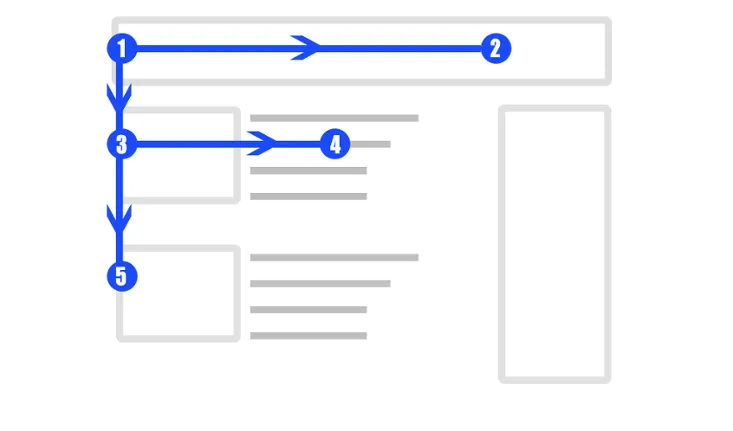
Familiar screens are a way to communicate some of the standard information that repeats from one app to another – for example, home screen or contact forms. Make sure they’re recognisable to users. They’re called familiar screens for a reason.
Failing all this, if there’s no way to avoid large pieces of information or complicated procedures, divide them into chunks. For example, here you can see how Facebook divided their registration procedure into steps to make it look simpler.
For more information about different tricks on how to make your app design more user-friendly, study this guide.
4. Spot successful designs
Steal like an artist – meaning notice good designs and try to understand why these are good. Click this link to find some.
- Implement the best practice.
5. Go for a UX audit
A third-party opinion is vital in the case of UX/UI design. An expert can give you unexpected feedback that will revolutionise the way you see the product. You can get in touch via professional forums like dribbble.com or the end of any design-related publication.
- Ask UI experts for advice.
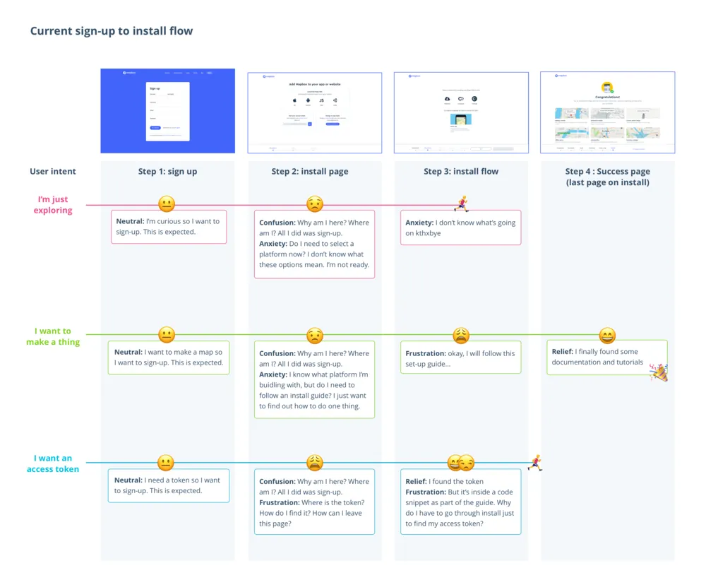
6. Test it on real users
Let real users try out your product and express their opinions on what it lacks. Start from a small focus group of your friends/relatives first. Test your draft as often as you need to until you feel there’s little left to improve.
- Test on newbies.
Remember all these steps and you’ll be very close to success. But to get there quicker, you need a bagful of good tools.
Tools for creating your prototype
In all honesty, a digital sketch or mockup always looks better than a paper draft. But to learn to use Photoshop, Illustrator, etc. will cost you half your life.
The good news is that working with the programs outlined below is relatively easy and, fortunately, you don’t need to know how to code.
1. Sketch
If you have zero experience in working with designing and prototyping tools, it’s highly recommendable to start from this one.
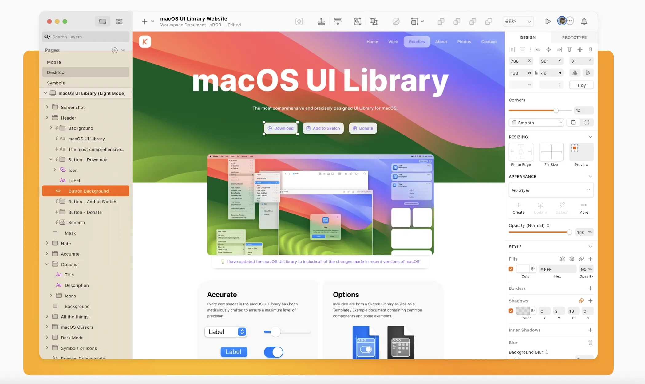
It has everything you might need:
- mockup constructor for apps and websites;
- intuitive vector editor;
- powerful collaboration tools.
You can make further use of the project you design with Sketch on and share it with your designers or developers.
2. Mockplus
This online resource was made to speed up the process of prototyping for professional developers.
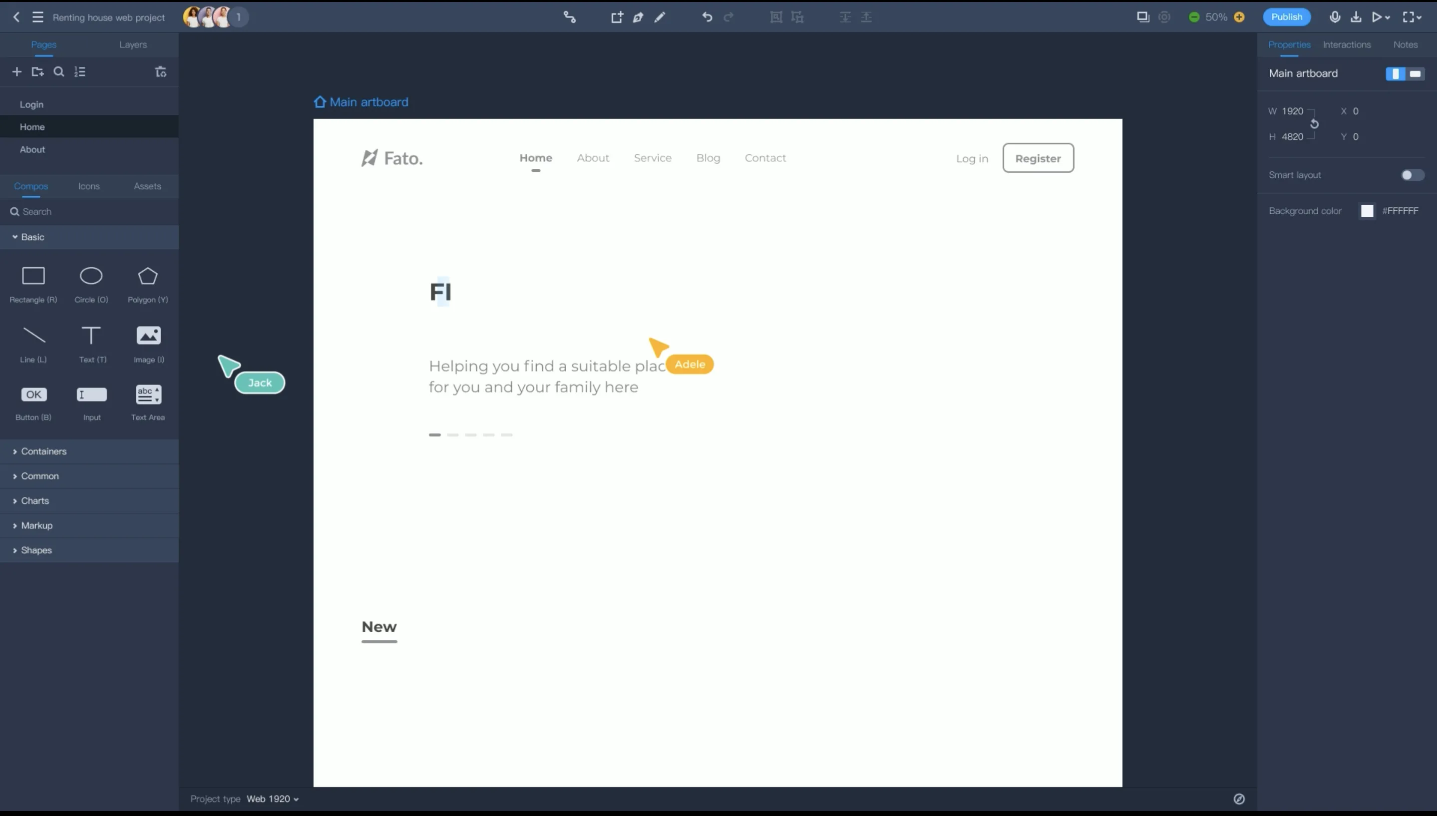
It has a set of pre-designed components including:
- pop-ups;
- stack panels;
- scroll Boxes;
- SlidingDrawer and Image Carousel.
All these make MockuPlus capable of creating cool interactive business app designs faster.
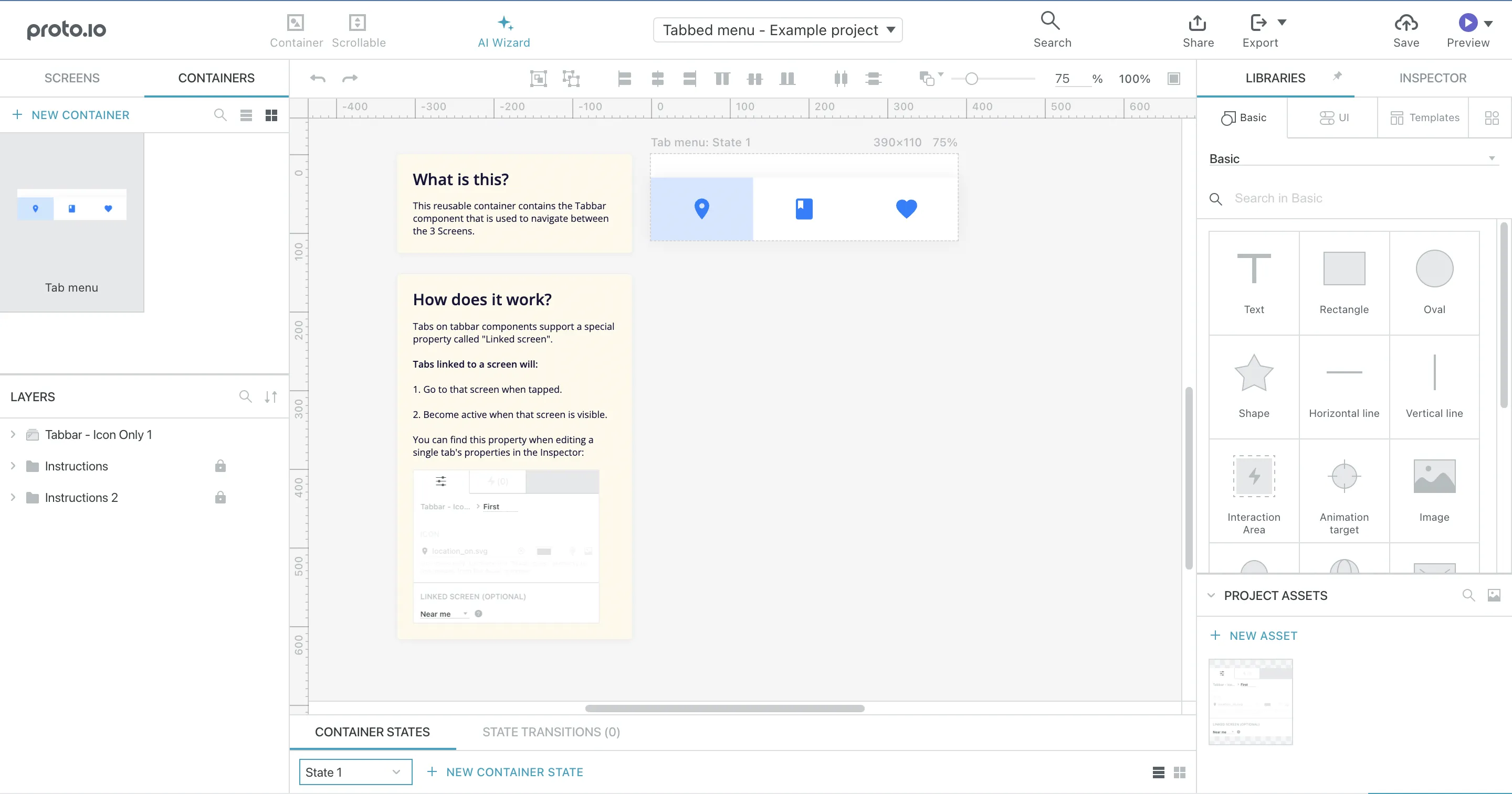
3. Proto.io
With this platform, you can create a demo of your app without having to hire a professional UX/UI. All the elements are customisable and the slides and other interactions look very natural.
Whenever you need to visualise your app idea, use this app. It offers a free 15-day trial period, and then you can subscribe to get unlimited access.
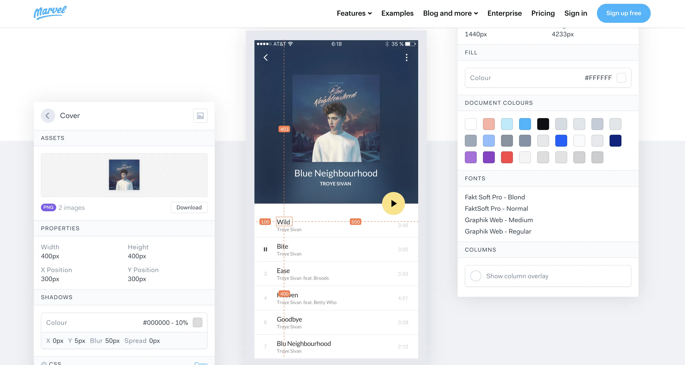
4. POP app
Sketching app designs on paper is still considered by many designers to be the most convenient way.
However, with this platform, you don’t have to choose. Moreover, you can easily transition from one to another.
This is a mobile app available on AppStore and Google Play.
5. JustinMind
A prototyping platform for creating anything from a wireframe to a coloured mockup.
This app is very accurate to mobile gestures and other mechanics, so you can be sure it’s fun and interactive if used correctly. The animations and transitions look exactly the same as they would during a real user-app interaction.
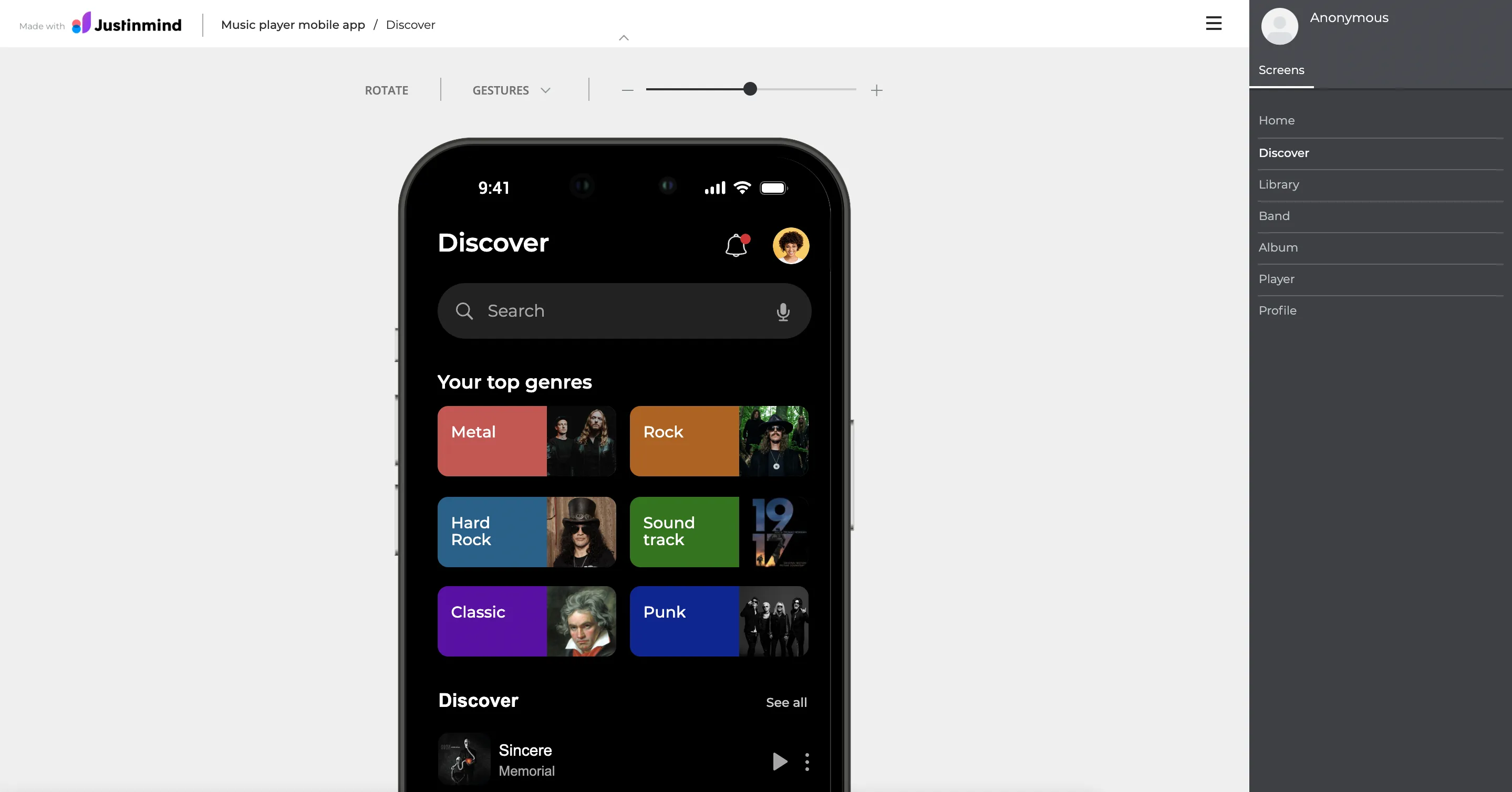
The platform offers a large variety of styles, fonts and colours. You can be sure your design solution will be truly unique.
Cool examples of app interface design
1. Trello
You probably know this business app that keeps all business communication in one place. It wouldn’t be so popular around the world if it were badly designed. It’s a great example of clear communication and smart layouts.
2. Duolingo
This is a hit in the world of educational apps. Look at how fun and interactive the designs are. A great idea is to use a brand mascot that helps to form an emotional connection with the user.
3. Food’n’Drink: Kitchen Stories
When you open an app, you intuitively understand how it works. You will easily find the receipt you need thanks to clear communication and minimalistic designs.
4. Colour by Disney
The company might not have been the first to launch an interactive app-colouring book, but they certainly did a nice job. It’s bug-free and well-designed. It also demonstrates that they know their audience well.
Useful links
Useful Links for Mobile Interface Design
Enhance your mobile interface design skills with these curated resources:
- Inspiration from Existing Apps: Explore a plethora of existing apps for inspiration and insights into successful mobile interface design. Discover innovative solutions and trends that can elevate your designs: Explore Existing Apps.
-
Google's Material Design Guidelines: This comprehensive guide provides principles, patterns, and best practices for designing Android apps with Google's Material Design.
-
Apple's Human Interface Guidelines: Apple's guidelines offer insights and recommendations for designing intuitive and emotionally engaging iOS apps
- UX Collective: UX Collective is an online publication featuring articles on UX design, including those focused on mobile app design and emotion-driven UX.
We trust these resources will be valuable in your journey towards creating exceptional mobile interfaces. Before embarking on your next design project, ensure to explore these insightful resources for a solid foundation.


