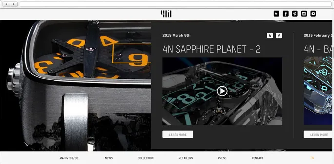
Web Design Trends of 2014

You can’t underestimate the influence of the Internet on our everyday life. It’s hard to imagine a successful business that doesn’t have a page in the global net. But this leads us to another question: if there are millions of sites on the web, how do you make your page stand out?
There’s a saying that you shouldn’t judge a book by its cover. But let’s face the truth - that’s exactly the way things work, really. If your site has a striking presentation and functions beautifully, it will give your potential clients the impression of a strong professional company. To achieve great results, as far as web design goes, specialists use any trick in the book. And this article is dedicated to discovering the latest trends in web design.
Navigation
A great and convenient Navigation makes your website really user-friendly. It also helps to make sure that there’s a quick way to find every bit of information easily. There are many creative types of navigations, but the latest and most common tendencies would have to be:
-
Unusual, Creative navigation – creating unique ways to move around the website:
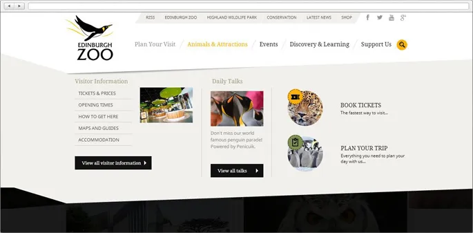
- Mega - Menus allow to see extra information. It’s a solution that works for websites with lots of original content.
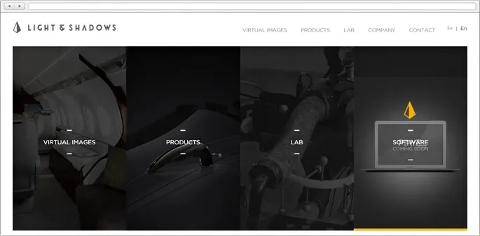
- Simplistic/Minimalist navigation – opposite to the previous trend, this one is all about efficiency, occupying less space and still remaining convenient. Probably inspired by mobile design, it’s all about using roll-downs, icons or menus that
minimise when you stop interacting.
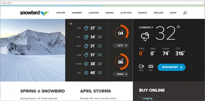
- Fixed position headers and navigation are especially useful for websites with scrolling – another common trend. They provide quick access to the menu no matter how far you are from the beginning of a page.
Scrolling
Scrolling is something really trendy, it’s widely spread and very popular. But the key is using it wisely.
-
Infinite scrolling allows
to send a viewer on a journey that ends pretty much never. It’s mostly used for websites, containing a lot of images. Asuser is scrolling down the page, more and more ofthem load.Popularity of this trend can also be explained by the fact, that designers think about mobile devices. But don’t create infinitely scrolling pages if there’s no need for it, it can be really confusing and inconvenient for users.
- Parallax scrolling is a fresh and innovative trend. There’s no point for describing it, just take a look and see for yourself:
Typography
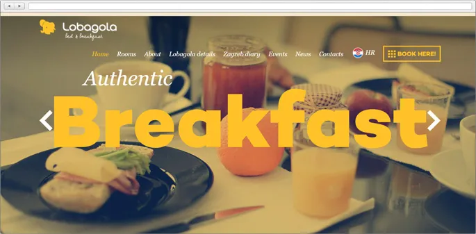
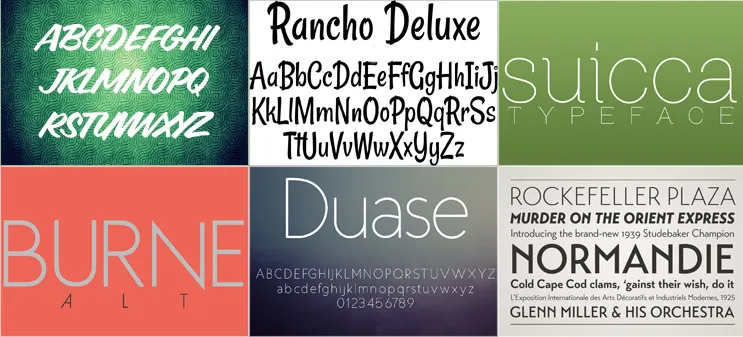
Designers today choose beautiful, creative and unique web fonts. They also prefer to use huge sizes that are more readable and responsive typography, taking mobile devices into consideration.
-
Handwritten fonts would probably be favored by those, who are feeling a little bit nostalgic and miss writing with
pen on paper. -
Mix and Match Typography
-
Flat Design Typography
Flat design
What can I say? It’s all over the place. Even though it seems like a step
|
Pixity Land |
Block Level |
|
Liberio |
EmailPostcards |
Trendy colour schemes
As far as
-
Multicolor. Add some fun and excitement by using every color of the rainbow. It works exceptionally well combined with flat design.
|
ImaginaNasFerias |
- Monochromatic schemes will help to achieve a clean look. Designers also suggest
to use classic combination of black and white with the third bright color to keep things interesting.
|
UpDroid |
Landing pages
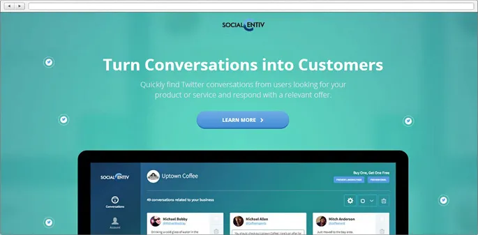
Creating landing pages is a new growing trend. Their main purpose is advertising. Because of that they are bright,
Richer content experience
Nobody wants to spend a lot of time on long, boring, “all-text-no-pictures”
Moving background
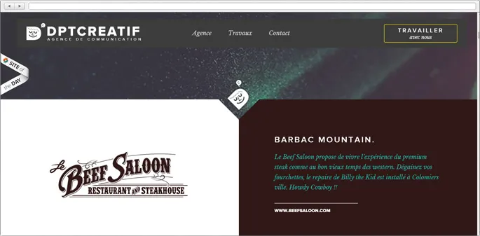
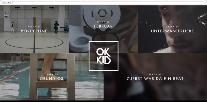
The secret behind video backgrounds popularity is, probably, that they bring life and motion to the table. It helps to captivate visitors and keep them interested.
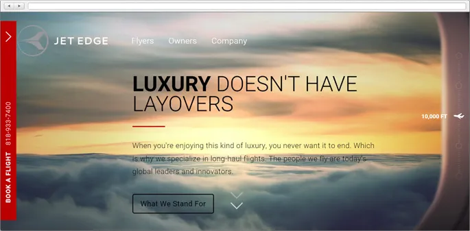
Big background images
Using
|
Lunet Eyewear |
MyStique |
|
Pablo&Rustis |
Expedition Broker |
As far as the technical side goes, a growing tendency here is using vector graphics, because they can be easily transformed with high quality still intact. Unfortunately, they’re not supported by some older browsers that are still in use.
Metro Grid
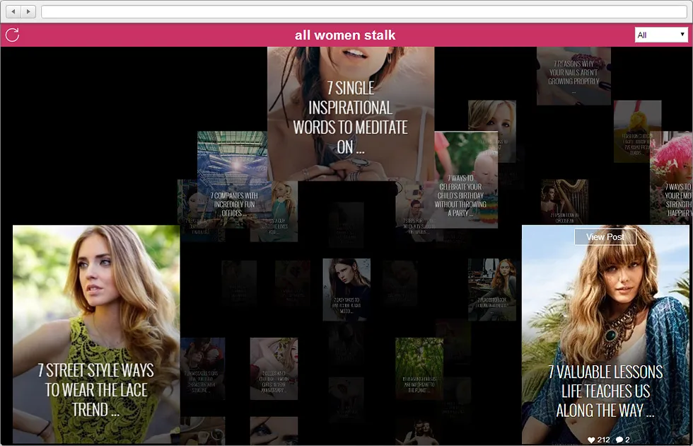
It’s all about making content look more appealing and engaging for users. Tiles work great for responsive design as well. With new trendy beautiful web fonts, bold gorgeous images and the addition of negative space in between they become visually striking and allow to have focused the viewers’ attention.
Mobile, mobile, mobile
Probably the major trend this year and years to come, as the role of smartphones, tablets and other gadgets in our life keeps growing. A new “mobile first” concept is a way of creating websites primarily for mobile devices. It helps to get rid of some unnecessary extras and have a clear vision of what’s really important and what’s – not so much.
You can choose one of these three options as your mobile solution:
-
Responsive website - content will automatically adapt to the screen size.
-
Mobile version - a separate website with its own URL.
-
Mobile app - a special app(s) that provides users with full access to the same services and functionality your website has. Or maybe showers them with even broader possibilities.
Each option has its pros and cons. Just go through the functionality and content of your desktop version and pick one that suits you and won't spoil the UX for your mobile users.
|
|
Lightfoot&Wolfville |
Minimalism
As we all know, sometimes “Less is more”. A minimalistic design helps to focus on what’s really important and
|
SM+P Architect |
Phoenix |
At the end
There are many other trends. The key to choosing the right ones is understanding what works for your content and your target audience. The Magora team can give you a helping hand with that and many other things, our knowledge comes from practice and experience. And we are always in on the latest news of the industry in order to provide the best services possible.
