Amazing App Design Trends 2018 to Set the Pace

The year 2017 was a bright and challenging one for mobile app designers. Stark minimalism competed with a variety of depth effects, gradients and stylization. Thanks to the new iOS 11 release, typography has grown larger and more eye-catching. Some trends have already become outdated while some will follow us into 2018.
In this article, we reveal the top mobile and web design trends and show you how to make your app attractive to users in 2018.
Large Typography
Big headers appeared in iOS 10 and flowed smoothly into iOS 11 in all basic applications. The trend was of course picked up by mobile app designers and web designers alike.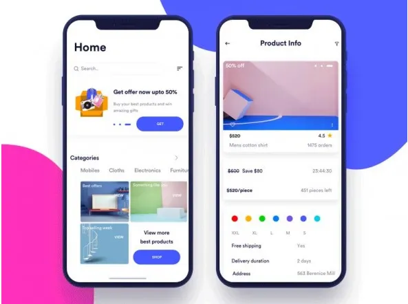
- Now headers get more attention and we are moving gradually away from small, centred font.
Material Design also helped a lot, encouraging designers to create large, left-aligned headings, e.g. in navigation chain design.
Maximum Minimalism
App design based on stark minimalism tramples on some fundamental laws of user experience. It’s a very clearly visualised design that brings the interface back to its sources - the most basic, bare components.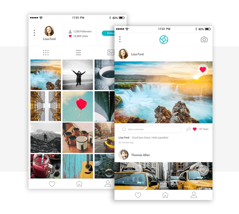
The result is a very neat appearance, especially suitable for photo apps.
However, a rather specific user experience and ambiguous icons may turn designers back to something more familiar and user-friendly in 2018.
Volume Effect
Delicate, low-volume elements were also propagated by Material Design. Their mission is to create contrast and make an app more user-friendly. Designers apply this principle in the most diverse and outstanding ways, using large, expanded elements, adding shades of colour and so on.
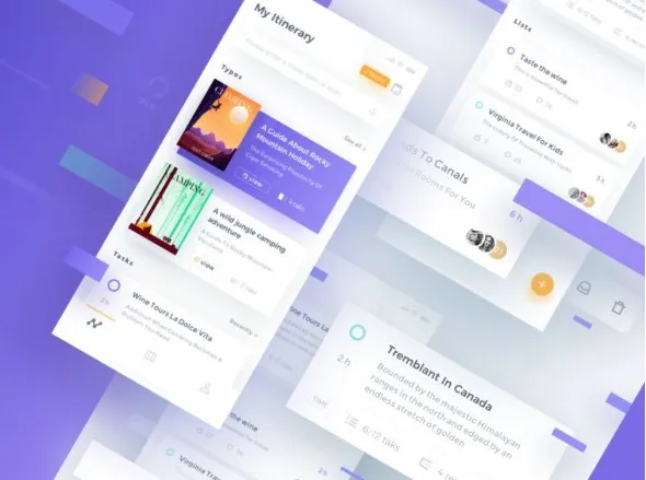
Even Apple is starting to use this technique, in particular in basic apps such as the App Store.
Bright Gradients
Bright gradients are a rarity in basic iOS and Android apps. Last year, however, these popped up often in app design on sites like Dribbble, with designers using bright blue, purple, yellow and other pleasing, vibrant colours.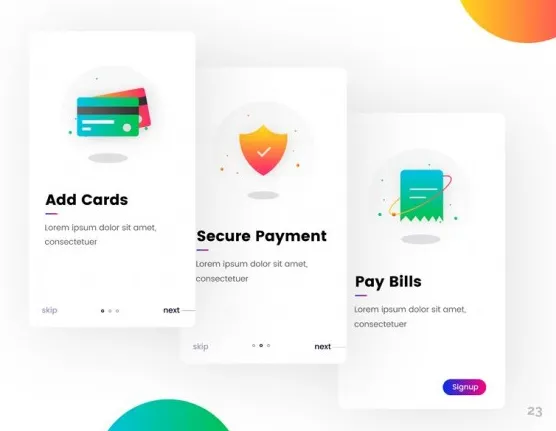
Especially strong are bright gradients applied to background graphics, buttons and other elements of the interface.
Card Design
The card style was introduced by Material Design and in 2017 it became almost standard in content-based mobile app design.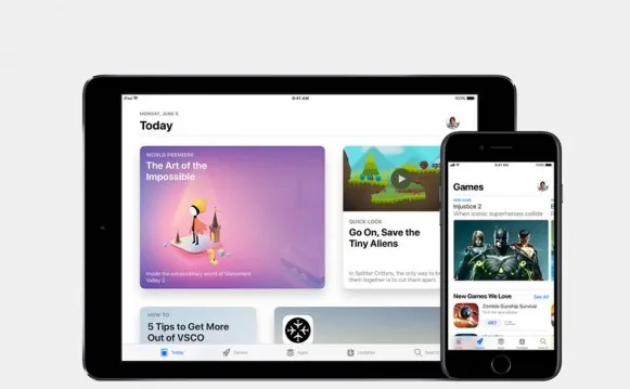
- Apple also began to introduce card-style layouts in its most important apps, as well as in the OS user interface itself, e.g. in notification design.
This structure is clear and easy to understand, which helps present content in a diversified and intelligible form.
Strong contrast for better readability
To increase software usability, especially on mobile devices, designers will use contrast colours and fonts.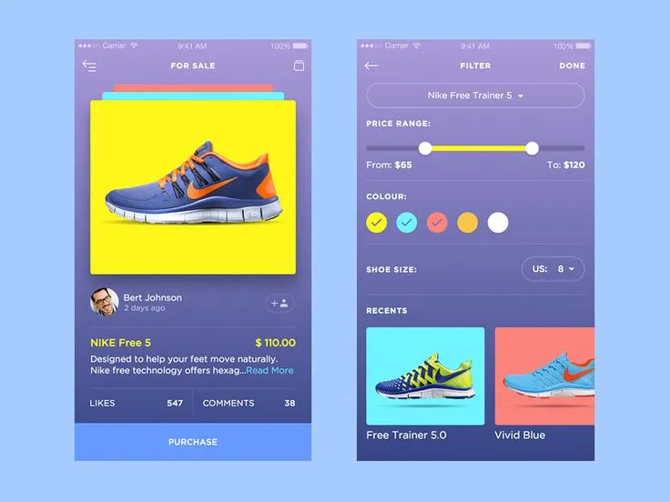
“And colour in different types and styles also creates sharp contrasts and makes entire designs more colourful and eye-catching.”
Transparency and Opacity
By manipulating with the transparency level you can add a fresh, attractive edge to any element of your design. 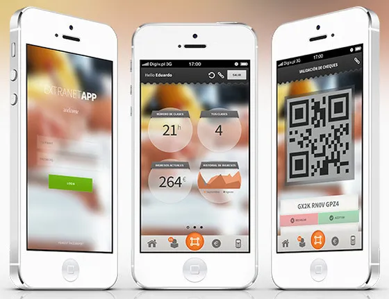
This trend is especially popular in UI design for mobile apps: setting the opacity of different elements is a great way to create an excellent app design.
Conclusion
It will be interesting to observe which of these trends continue to gain traction in 2018 and what new app design styles appear.
If you have a design concept for your project, we are always ready to discuss it and help you choose the best style for your brand.


