Creating an App Prototype: Sketch, Mockup and Wireframe

Wireframes, mockups and sketches... Some people acknowledge the existence of colour app prototypes, others recognise only black and white. Some might say a mock-up can be interactive, others will disagree. Let’s discuss each of these terms in detail.
What is a Prototype?
An app prototype is a sketched application. Think of it as a skeleton.
To make the prototype interactive, the designer draws up schematics of all the pages of the future app or website using some specific tools and assembles these screens into an integral model, establishing connections and links.
- An interactive app prototype can be compared to a 3D model of a future building used by architects long before construction begins.
Who is Responsible for the Prototype’s design?
The prototype of the site or app is usually created by the UI/UX designers: people who analyse the user’s behaviour, form roadmaps and, finally, visualise the software interfaces.
This is a profession aimed specifically at creating effective layouts and dashboards, providing visitors with conveniently-designed software functionality.
- It’s ideal when the interface designer also has an understanding of content marketing and lead generation funnel principles, as UX modelling lies at the crossroads of marketing, management, design and technology.
Importance of the Visualisation
The prototype allows the application to be demonstrated in action at the early stages of development before programming begins. With a clickable prototype, you have a chance to see the main screens in use.
- It’s even possible to click the buttons and figure out the connections and mutual dependencies of the interface elements, though there is no real programming behind it – it’s just an emulation of the full functionality.
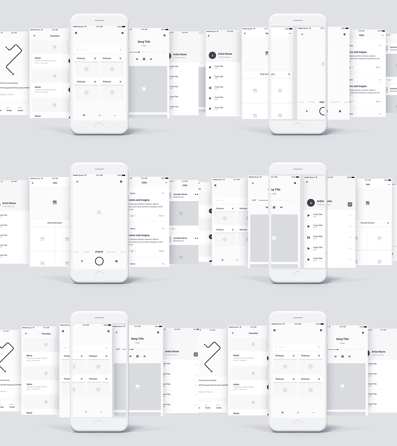
The app prototype allows you to:
- assess the app in action and understand how well the designers’ team are expressing your business idea
- determine whether to make changes to the existing plan for an app’s interaction with the user;
- easily add functionality or change the priorities
Having a ready-made app model on-hand is also useful if:
- You need a clear vision of all cross-functional features.
- The future mobile app is the foundation of your startup and a working visual model will be an advantage when seeking additional investment;
- You want to test the application concept on a focus group before embarking on the most expensive stage – programming and testing.
Creating a Prototype
The choice of possible approaches for prototyping is very broad.
Conventionally, all the relevant tools can be divided into 3 groups according to the type of media:
- on paper;
- on the computer screen;
- on a mobile device.
Thus, we will observe the following ways of creating a prototype:
- Sketch
- Mockup
- Wireframe
Sketch
When it comes to visual details, it’s much easier to sketch with a pencil than to explain an idea with your fingers.
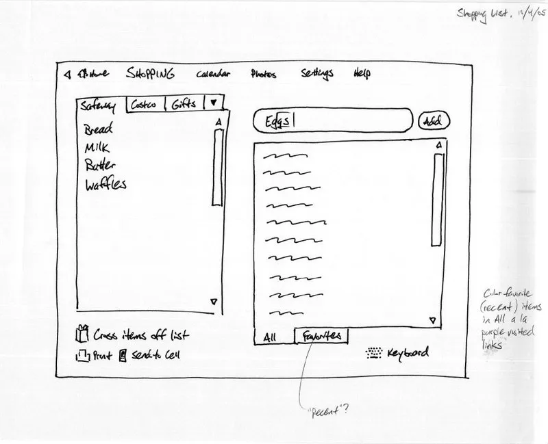
The advantages of on-paper prototyping are obvious – this is the fastest way to create a future application layout. However, the drawbacks arguably outweigh the positives.
A static prototype (or its paper version) does not allow you to see the app in action – this is extremely inconvenient when it is necessary to demonstrate the software functionality via the Internet.
The Use of Wireframe
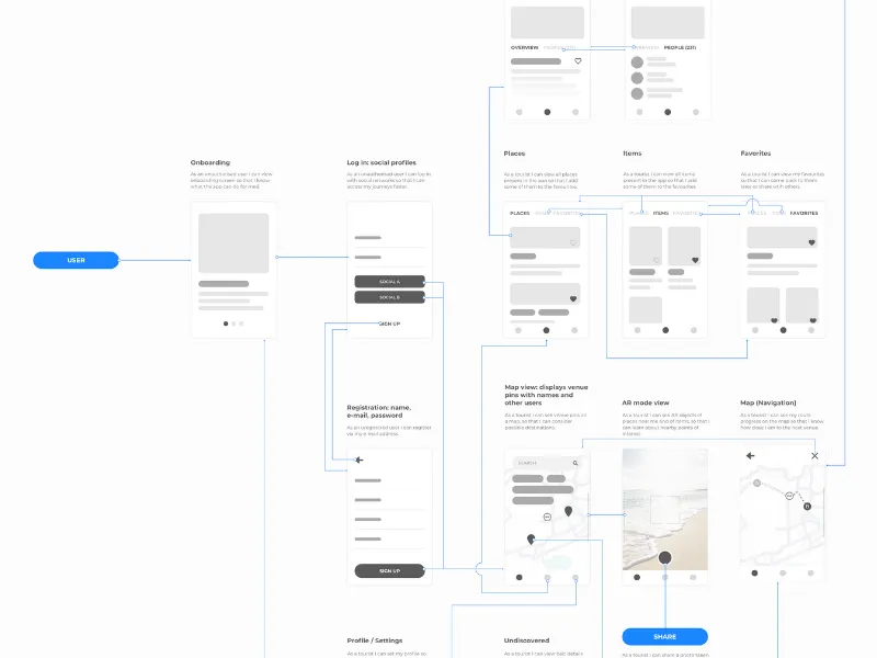
Wireframe is a basic (schematic) version of the overall design. No unique images, fonts, logos or even text are needed here – the most basic UX symbols and simple boxes for text visualisation are enough.
A wireframe can be compared to a building plan – it will be used as a guide during construction (in our case, when developing a site or app), but it is impossible to live in it – it does not perform any real app or site functions.
A wireframe is used to determine what will be included and where.
The Meaning of Mockup
A mockup is the midpoint of a highly-precise, static-design image. Mockups often consist of graphic sketches or even actual graphic design.
What does it do?
- Represents the structure of information, visualises content and demonstrates the main functionality in statics.
- Encourages double-checking of the visual side of the project.
A mockup does not provide any user experience in terms of the organisation of interface navigation elements or interaction with them. Nevertheless, mockups are very handy for collecting feedback.
Wireframe vs Mockup
Wireframe
In order to give a wireframe the right look, you need to understand its assigned purpose.
We create wireframes to share the understanding of what elements are located on each page and how they are arranged. Visual clarity helps all project participants to see the structure and general idea of the software, without being distracted by the appearance of individual elements.
- By adding colour to a wireframe, you mix its function with the mockup, the task of which is to discuss branding, visual impression and style.
Tools for Wireframe
- Wireframe.cc. (Pros and cons of this tool and full description here)
- Adobe Xd
- UXPin
- Balsamiq Mockups
- Visio
- Fluid UI
How to use them and what the differences are - find here.
Mockup
In general terms, a mockup – or mock-up – is a model (full-sized or scalable) of a real object or design. In IT, it refers to a detailed wireframe with coloured images.
The presence of colour is the main difference between a mockup and a wireframe. Mockup prototyping is necessary to create a style and mood for the project. If a wireframe represents the bones of the project, a mockup contains the design image itself. It’s important to think over visual trivia and coordinate it with the brandbook and guidelines.
*Mock-ups are often confused with wireframes due to the names of some software tools, e.g. Mockup Builder.
Tools for Mock-ups
The list of the most promising tools for creating wireframes and mockups includes: Adobe Xd, Mockplus, Moqups, Marvel app and Mockflow. These tools are used by professional UI designers. You can find a comparative breakdown of their features comparison of their features here.
Conclusion:
Prototyping is an important stage of software development. The next steps we take to represent your future software are as follows:
- to roughly represent your idea, we sketch it;
- to structure all the screens and blocks, we use wireframes;
- to demonstrate further interactions, we create clickable prototypes;
- and to show all the bells and whistles, we add colour with mockups.
Thanks to clickable app prototypes, everyone can get a visual sense of the concept of the future software and clearly understand how it will look and work.
If you have any particular questions about software design or suggestions as to what topics should be described on our blog, do not hesitate to send us your request via live chat or the website form or give us a quick call.


