Pop-ups to Increase Conversion of Your Website

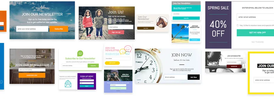
For the past two decades, pop-ups have remained one of the most popular trends in website development. They can easily convince the visitor to perform an action you need them to and greatly improve your website’s UX.
If the first thing you think of when hearing the word “pop-up” is an irritating full-screen advert, you’re forgetting about other types of
In this
What are Pop-ups?
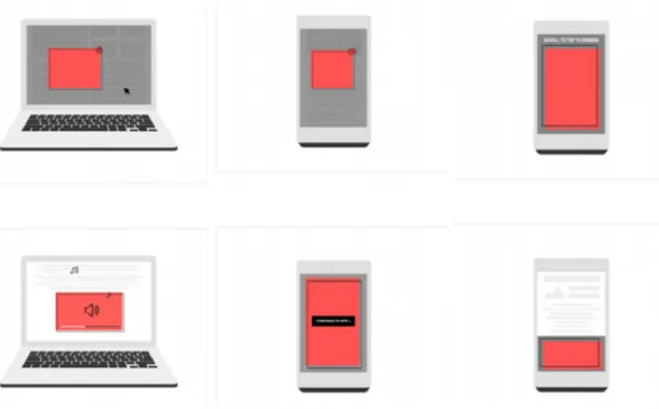
Not all windows can be called pop-ups and not all of them are used for advertising.
Pop-ups are not necessarily something intrusive or meddlesome. Through their proper use, you can motivate visitors to perform the action you need them to and help them navigate your site or application. To do this, you just need to determine the type of a pop-up window and content you want to put there.
Before understanding their differences, let's discover the term "modality".
Modality
Depending on the context, the term "modality" can have two different meanings.
- With respect to the interface as a whole, it implies availability of different modes: for example, for a set of capital letters, you need to press Caps Lock – that is, switch to / select another mode.
- When we talk about pop-up windows, modality means blocking work with the interface until the window is closed (usually involving the blacking out of the background).
Classifications of Pop-up Windows
Now we can disassemble the classifications.
Pop-ups
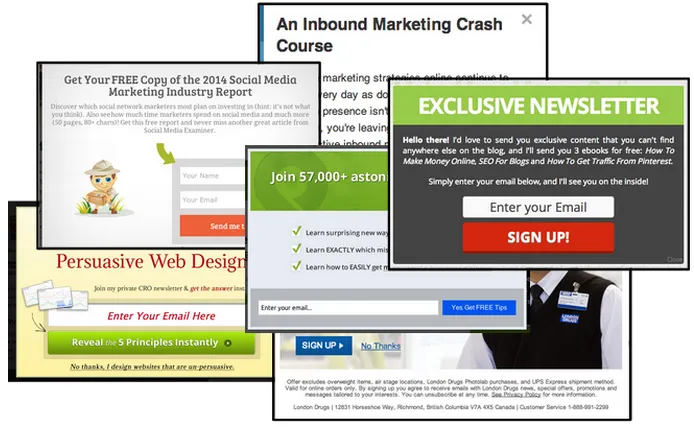
A pop-up itself is a window that the user didn’t purposefully bring up.
Here’s a list of tips to make your pop-ups more attractive:
- Formulate clear call to action.
- Use bright
colours . - Make your offer really useful.
- Don’t be forceful.
Always remember that users who come to your website are people with their own values. Don’t impose your services on them or compel them to perform the action. Catch them not through the number of ads but through pleasant bonuses.
Notifications
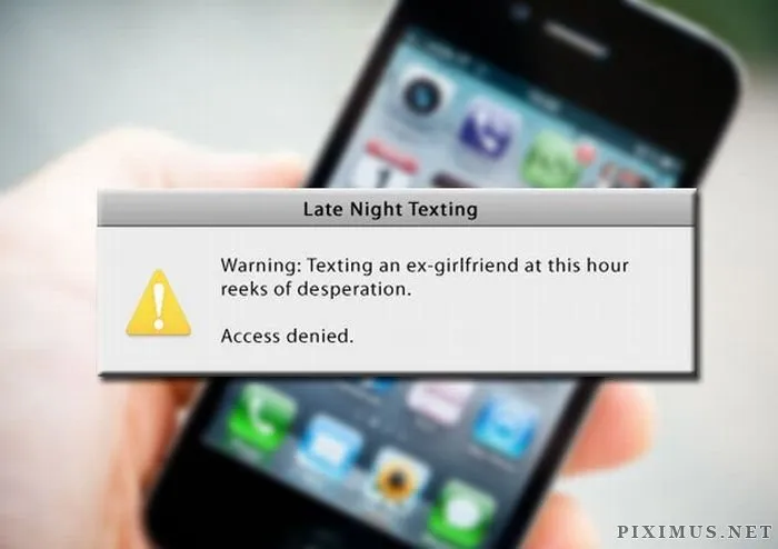
Notifications report that a process has started or ended, or that some action has taken place.
Remember: The text of notifications should always be brief but
Read more about notifications here.
Alerts
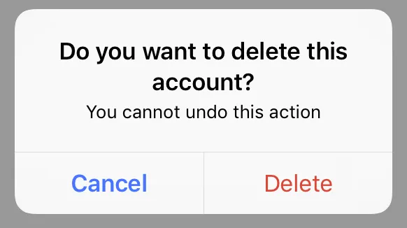
An alert is a pop-up window used to report an
Since they interrupt the user’s work, alerts should only be used in extreme cases – for example, if you permanently delete a file or to confirm a purchase.
A good alert always has an informative text explaining what has happened and why it’s worth the user's attention.
- The phrase "An error has occurred!" is an example of a bad alert, since it doesn’t report any useful information, but if you replace it with "There is no connection! Check if your computer is connected to the network ", then the user will become much more aware of the problem and how to solve it. Read about how to deal with errors and empty screens.
- In a good
alert there are no more than two buttons, while the title of each is a verb describing the action that results from their being pressed. For example, the "Yes" and "Cancel" buttons seem to be understandable to the user, but if you change them to "Delete" and "Cancel", this will be much better.
Light boxes
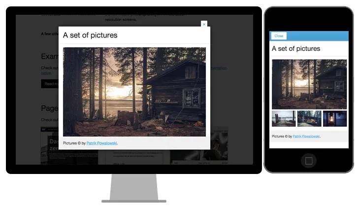
Windows of this kind are used to enlarge the item that the user wants to focus on. Basically, light boxes are used in galleries to view pictures.
For example, to thumb through images without leaving the lightbox, use thumbnails inside the window or the left and right arrow buttons.
Light boxes can also be both modal and non-modal.
Dialogues
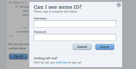
These are dialogue boxes that the user opens independently and performs various actions within. They can be modal (for important and one-time tasks) and non-modal (for frequent and repetitive tasks). The range of use of such windows is very wide.
Tooltips
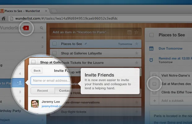
A tooltip is a pop-up window displaying additional or reference information. They can be brought up either by hovering the cursor over an element or by clicking on it. Tooltips are always non-modal.
Popovers
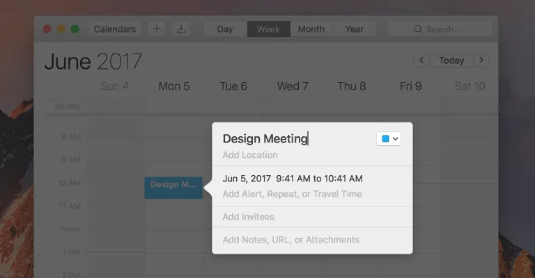
If you mix the dialogue box and the tooltip, you get a popover. This is a non-modal pop-up window that appears at the
You may use a popover to access additional functions or partitions.
Remember: only one popover can be opened on the page at a time – upon an additional one being opened, the previous one is closed.
What to Consider when Planning your Pop-up Windows
The use of two or three pop-up windows may seem excessive or superfluous, but to use one at the stage when a user is about to jump to another site can be a good chance to catch his or her attention and to prolong the dialogue with some sort of special offer or subscription suggestion.
Proper compilation and placement will help achieve the desired result.
- Follow the rules of a specific platform. For example, in OS X, the modal dialogue always appears at the top and allows you to resize the parent window, whilst in Windows it always appears in the middle of the screen and tightly blocks the parent interface.
- Experiment. The same window on each page of the website or after a certain amount of scrolling will result only in negative responses. Use different types of pop-ups, but not all at once.
- Test it. Before you embed a pop-up window into your resource, be sure to test how it will look. Pop-ups should not interfere, but they must still be noticeable.
If you’re on your way to website development, contact us to discuss your project.


