
Why Is a CTA Button Important for Your Site?

Button with CTA or Call to Action is a necessity for your online lead generation. When reading endless recommendations about the optimal
What is CTA?
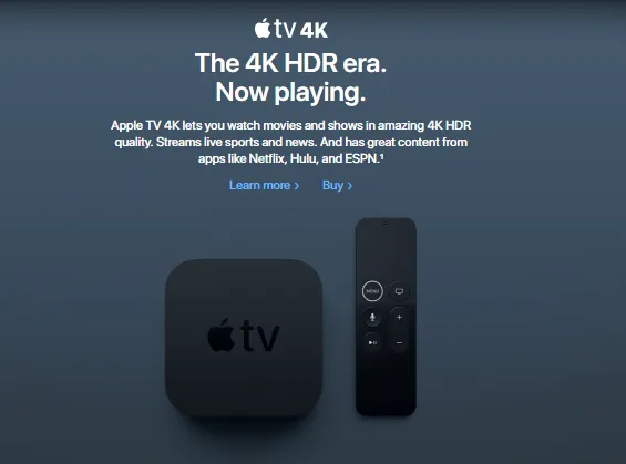
CTA (Call-to-Action) is a "bridge" between the conversion and user actions. Conversion is the coverage of people who have moved to the site. This button makes it possible to achieve a certain goal more effectively.
A good CTA button is simple, minimalistic, and fits the overall style of your site. If you have many call-to-action buttons, the user will not interact with all of them. You can ask users to make an order, but adding a few more actions on the same page is a bad idea. Sometimes it’s better to move your call-to-action into the website footer.
How to Make Your Button Work

- Colour. The button’s
colour should supplement the general concept of your website. In the case of the image above, the skillfully chosencolour fits perfectly into the design and makes the right accent. - Words. Even those who’ve come just to look at the site will pay attention to the word "free".
- Message. Again, if a user monitors the site, even if they don’t have the first idea about a subscription, he or she will think: "why not?". Free month-long subscriptions on popular movie and music portals catch visitors much faster.
But "catchiness" doesn’t always work - especially if the button is placed near topical goods or services. The main focus is no longer on it. Users will search for it themselves. In this case, the call button becomes only a part of a larger advertising campaign.
If you have a landing page, then you already know:
- How you plan to promote it;
- What the sources for promotion are;
- Where the landing is located;
- Its purpose / task;
- What you sell.
Therefore, your new goal should be "unobtrusive." A good advertising project is, first of all, soft. Consider this example.
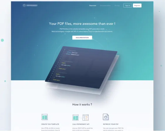
Thanks to the design, the user understands that their PDF files will be improved.
Pay attention to how harmonious the text,
Let’s Consider a Couple of Examples
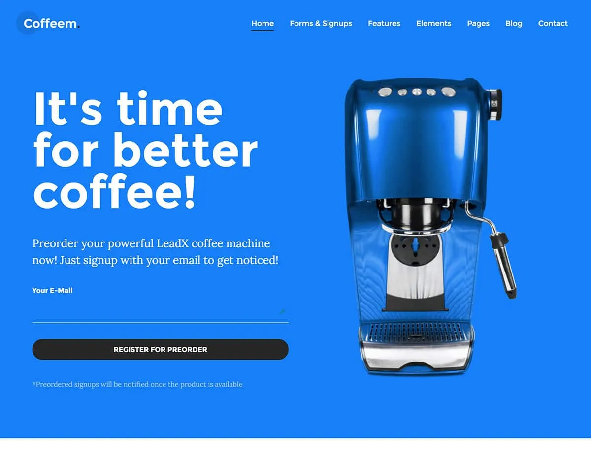
On this landing page, the catchy background has unequivocally been perfectly chosen based on what the coffee machine looks best set against.
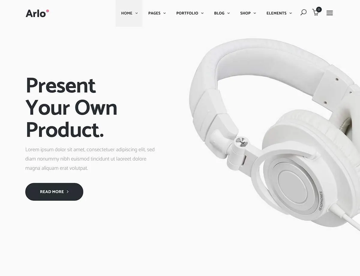
In no case can the CTA button be considered separately - it is part of the overall picture.
About the Most Important Aspect
There is no definite formula for CTA success. In fact, the key secret is the overall harmony the page creates. If the purpose of the page is to sell goods then, in this case, the button should be catchy. Here we can already talk about a specific
The main thing is that the user’s attention should immediately be drawn to it.
If the purpose of the page
Let's Summarise
- Optimal
colour for CTA doesn’t exist. - There’s no need to focus on bright
colours all the time. - Test the CTA button.
- Understand what target audience you work for.
- Develop a marketing plan for your landing.
- CTA strongly affects conversion, since this is the user’s final stop (where they
register / buy )
Find more design ideas and inspiration here.
Call-to-action is a priority element of the


