5 Best Website Footer Design Ideas: Key Things to Put at the Bottom

The footer is an important section for website visitors who want to find more information about your company. When creating a footer design, you face a difficult choice: which elements to include - after all, a
Why is a Footer Important for Your Website?
- It focuses on specific content;
- It helps generate leads;
- It provides users with helpful information;
- It guides your visitors;
- It keeps the user's attention.
If you want to keep visitors' attention to “the bitter end”, we can help you make your design creative or even entertaining - just follow our tips, get inspiration or share your ideas with our team to get professional advice for your case.
5 Successful Design Practices
The Magora team
1. Minimalism

Source: awwwards.com
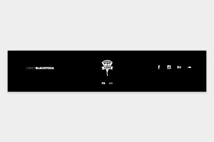
"Simplicity is an extreme degree of sophistication," according to Leonardo da Vinci. An overloaded footer is not always informative. Try to focus on one or three elements and stick to a minimal design. We offer such a combination: a copyright icon, a logo
2. Site map

Source: furrion.com
3. Contact Form / Newsletter and Social Networks

Source: behance.net
When it comes to contact forms, we at Magora adhere to three positions: top right, bottom right and bottom
Another secret of attracting users is a module for newsletter registration. We recommend this function as a design element for online stores. Specify what will be included in the newsletters, as well as how often you plan to send
4. Call to action

Source: dribbble.com
Drop us a line! We invite you to collaborate. Leave your phone number and we’ll contact you within an hour. A simple but catchy call to action in a footer, combined with a newsletter or contact form, can help you increase the conversion rate. Make sure it’s clear and comprehensive. Remember that readers don’t want to bother learning how to do this or that action.
5. Contacts, phone, address

Contact information - this is what anyone expects to see in the footer.
A phone number with a country code helps search engines determine where you are. Make each link clickable so visitors to your website can dial a number or send letters with one tap on their smartphone.
How to Create a Good Footer

Source: www.nothern-classics.de
Have you found a great idea for your website’s footer? To prevent problems in implementing this idea, draft a plan outlining what you want to see at the bottom of each page.
1. Identify the Main Elements
- Reconsider the structure of your site and decide where the footer should be located; select a template.
- Make the footer responsive to the mobile version or application.
- Make it unique for different pages - for example, add a map to the Contacts page.
2. Design a Footer Space
- Determine the size of the footer and the number of sections and columns and arrange them according to priorities or standards. For example, contact information is usually placed in the
centre or right-hand corner of the footer. - Leave the footer at the bottom of the page or tie it with HTML and CSS templates to "fix" it when scrolling.
3. Add Unique Items
- Insert links to social networks, Twitter widgets or the Facebook "subscribe" button.
- Add an advertising plugin.
- Integrate Google Maps or other maps of your choice.
- Support a single style: choose a footer template in Bootstrap or WordPress or create a unique one incorporating your business’s preferred
colours and styles.
Don’t rush to apply all these tips to your site. Think about the target audience and act according to their needs, because the footer design, as well as the process of its creation, can vary depending on the specifics of your business. Write to us and let the Magora team help you create the perfect website design.


