
UI/UX Design in 2024: trends, principles, and best practices

Table of contents
- Understanding your user personas
- The 6 Gestalt principles
- Content design principles
- The importance of Customer Journey Mapping
- Utilising user interviews
- Functionality matters
- Interaction Design
- Contextual personalisation
- Usability matters
- Understanding the UX
- Do your (UX) research
- The Essence of User Stories
- User-centric architecture
- Wireframes and mockups
- UI trends 2024
- UX trends 2024
- AI-integrated design
- Looking ahead: conclusion
Embarking on the journey of user experience (UX) and User Interface (UI) design is both a science and an art. In this article, we underscore the significance of data-driven development, and delve into the core principles and methodologies that define a stellar user experience—from Gestalt principles and content design to Customer Journey Mapping (CJM) and user interviews.
As we traverse the realms of user stories, adaptable architectural patterns, and the imminent UI/UX trends of 2024, our intention is to equip designers, developers, business leaders and digital product owners with the insights and strategies they need to shape the future of digital interactions.
Understanding your user personas
In this case, it’s a science, not an art.
Research by HubSpot suggests that the data-driven development of user personas can increase your web and mobile app’s traffic by a whopping 210% and make it ‘2-5 times more effective and easier to use by targeted users’. To see results like this, the personas must be crafted from analytics and research derived from ‘your existing customer base’ – it’s not enough to simply look at age, occupation, gender, and location.
With user segmentation and targeting throwing up such excellent results, it’s clear that tailored results win prizes. Diverse user preferences must be considered in your UX mapping and planning if you want to stay ahead of the game and drive maximum traffic to your digital product. This logic is applicable across all markets and industries.
To understand what we mean by diverse user preferences, it is first important to understand the different ways people perceive information. In relation to UI, “perceptions” refer to the way users interpret and interact with the visual and interactive elements of a digital interface.
Nielson Norman Group, a world-leading consultancy in research-based user experience co-founded by the author of The Design of Everyday Things Don Norman – he in fact coined the term ‘user experience’ – speak of the ‘similarity principle in visual design’: ‘items which share a visual characteristic are perceived as more related than items that are dissimilar.’
To ensure your user easily understands your UI, it is important to apply ‘visual rules’ to ‘each type’ of element. As your user explores your product, interacting with the various elements, they will develop ‘expectations for how other similar elements will function.’
To give an example, relationships between UI elements are easily recognisable if they share a common trait, e.g. the same colour, shape, or size, while the hierarchy of your buttons are quickly understood if you apply the same principle.
In our imagined scenario, yellow buttons are recognised as portals to the most important information – ‘buy now’, for example – while green buttons are portals to less important information – secondary research, for example. Yellow signifies products and purchase; green signifies background information that might encourage you to buy.
From here we lead on to…
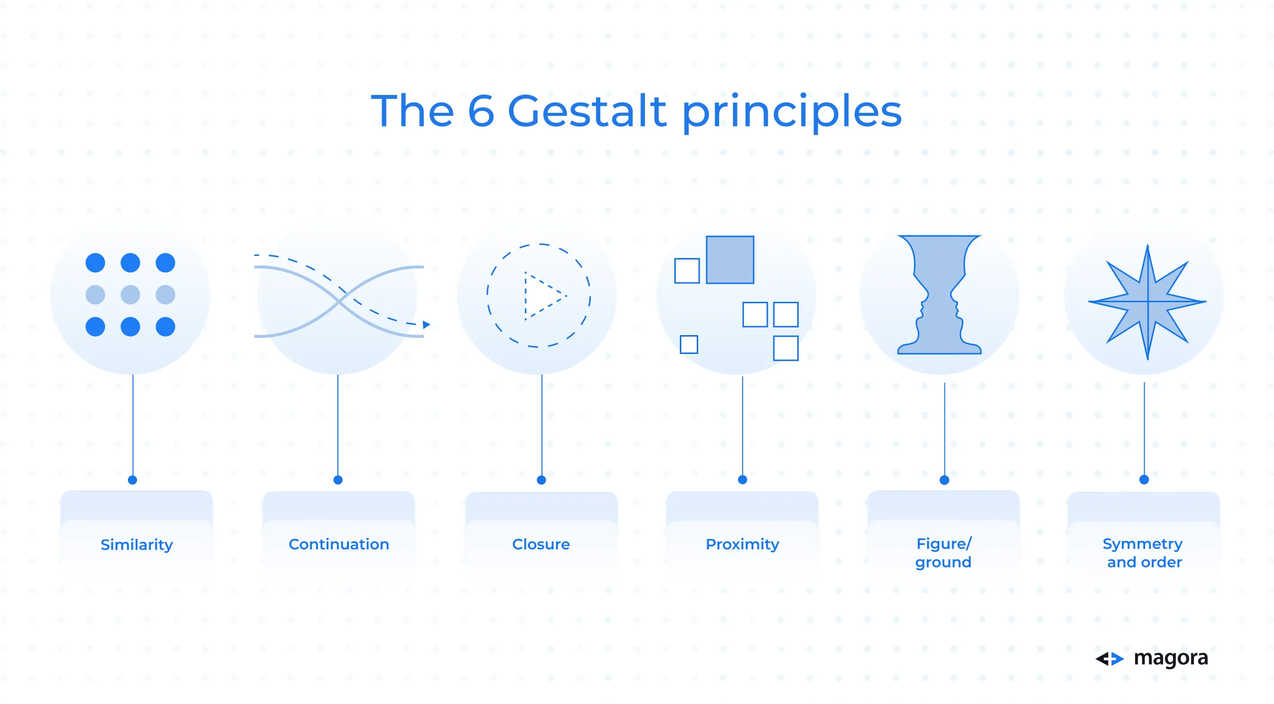
The 6 Gestalt principles
In other words, ‘laws of human perception that describe how humans’ organise ‘visual information’ by grouping ‘similar elements, [recognising] patterns and [simplifying] complex images when we perceive objects’ as summarised by Interaction Design Foundation.
For the purposes of this article, we will focus on six widely recognised Gestalt principles that can, and should, influence design.
These principles are:
Similarity, as outlined above.
Continuation
The human eye naturally tracks the paths, lines, and curves within a design, displaying a preference for a seamless flow of visual elements over distinct objects.
Even when an obstacle obscures the path or the continuity is interrupted by interconnected or intersecting visual elements, our eye tends to persist in following the established visual trajectory.
Closure
Humans have an inclination toward whole and complete shapes, which leads us to instinctively bridge the gaps between elements and perceive a comprehensive image at first glance.
This fact offers a creative opportunity to earn users' trust. Skilfully arranged elements such as lines, dots, or shapes can result in aesthetically pleasing "wholes" that users will appreciate, enhancing the overall user experience.
Proximity
We perceive grouped elements as a unified entity on the screen. By clustering elements in closer proximity and distinguishing them from those positioned farther away, your design forms cohesive visual groupings.
Figure/ground
Our aversion to uncertainty leads us to seek solidity and stability in the elements we encounter. When presented with an image, our instinct is to identify its foreground unless the image is deliberately ambiguous.
The concept of figure/ground, primarily applied through contrasting elements, such as light text on a dark background, plays a crucial role. Deploying figure/ground effectively, in conjunction with considerations like colour theory, not only guides users through tasks but also reduces cognitive load.
Symmetry and order
We have an innate human inclination to streamline complexity. In a world where our senses are inundated with stimuli, and our attention and processing capacity are constrained, symmetry and order serve as guiding principles, allowing us to perceive structure and regularity amidst the visual chaos.
By shaping data-driven personas and considering UI perceptions from the outset, we put ourselves in good stead for a highly effective web and mobile app that drives traffic and engages the user.
Content design principles
Aimed at guiding, informing, and delighting users throughout their UI journey, content design ‘is a relatively new (yet increasingly popular) multidisciplinary approach to creating and structuring high-quality content.’ While it is centred on the creation of content that fulfils user requirements, the approach also prompts actions that align with overarching business objectives.
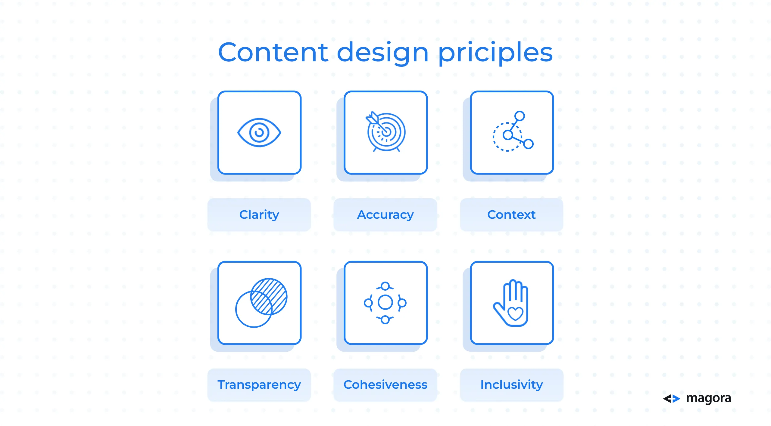
In addition to Gestalt principles, there are six content design principles that we should keep in mind for the successful mapping and development of our digital product, as noted by the UX Design Institute.
They are:
Clarity
Ensure your message is clear so it is quickly understood.
Accuracy
Your information should be accurate to promote trust.
Context
Provide context to your messaging to ensure there are no crossed wires.
Transparency
Honesty is the best policy.Communications transparency, from the sources you’ve used to the objectives of your content, is crucial for trust and relationship building.
Cohesiveness
Each UI element should link to the previous and lead on to the next, keeping ‘the content [flowing] logically and coherently’ and ensuring your overarching message carries through.
Inclusivity
Inclusive content will ensure that you are ‘accessible and relevant to a diverse audience’ – don’t silo, instead open your product up to resonate with a broader audience.
The importance of Customer Journey Mapping (CJM)
An ‘essential’ step before embarking on ‘a major customer experience redesign’, Aragon Research describes CJM as ‘visuals or graphics that depict the customer relationship with a company, their service, and their product over time.’
Mapping your customer’s journey, i.e. the series of engagements they have with your business across various channels to accomplish tasks like purchasing a product, renewing a subscription, or seeking support, helps you better understand how consumers achieve their objective and where/how they interact with your brand along the way: what is their experience and how can we improve it?
Knowledge is power.
When you understand how they reach their objective and whether there were any obstacles that prevented them from reaching it sooner, you can start improving, repairing, fixing, and growing your success by preventing the loss of sales caused by technical inefficiencies.
An invaluable tool, CJM is the foundation of any UX/UI project.
Utilising user interviews
Commonly utilised in the discovery phase of a software build, user interviews are a popular way to carry out detailed UX research. The process works in the same way as a traditional interview would: the designer, developer, project manager or another team member will ask a series of questions to select participants seeking answers that could help shape the user experience and/or validate the product hypotheses. Depending on your identified user personas, the desired user experience may differ from project to project, brand to brand.
The outcome should be a clear and thorough understanding of challenges and requirements, ensuring that the product addresses what users truly need but, perhaps, lack.
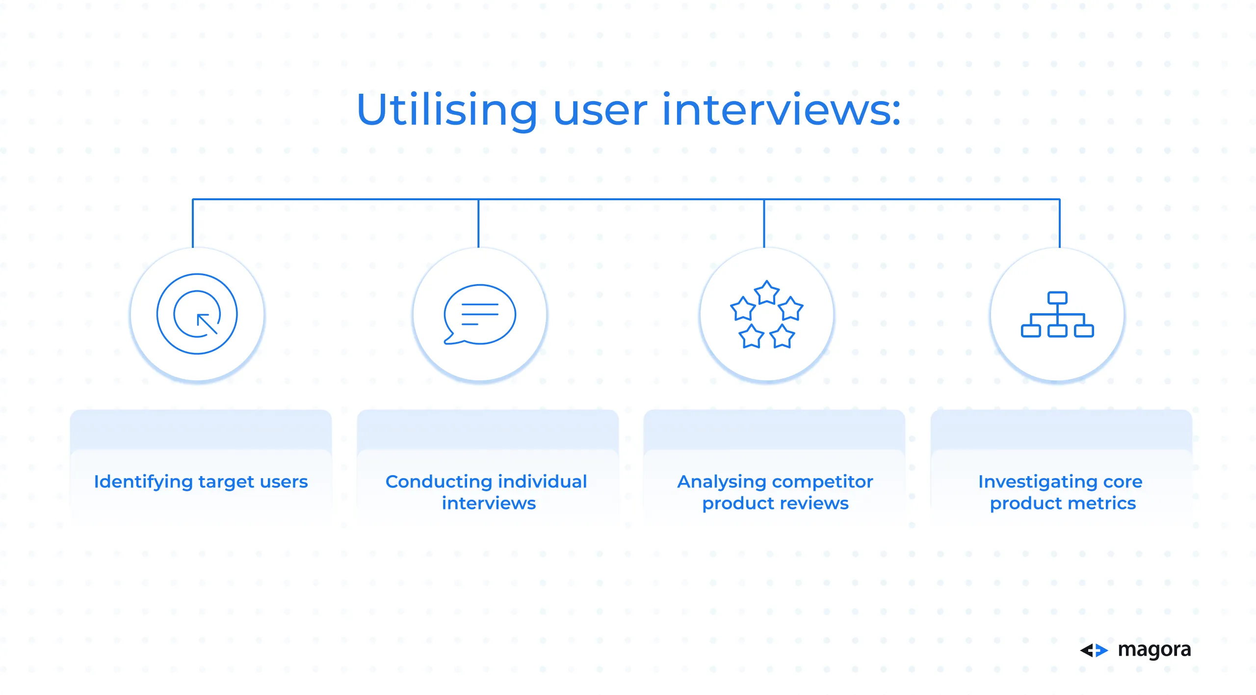
To ensure a successful interview, the interviewer should take a systematic approach that encompasses:
Identifying target users
Keeping in mind our earlier mention of personas, who are you targeting? Your participant should represent your target user.
Conducting individual interviews
Your interviews should be one-on-one to ensure you garner the information you need.
Your interviewee should have space to voice their honest opinion on topics like pain points, preferences, and expectation. You are less likely to obtain a comprehensive understanding of their needs if two or more people are fighting to speak over one another.
Analysing competitor product reviews
Gain insights into the strengths and weaknesses of existing solutions by researching what users think of your competitors. This will assist you in identifying areas where the product can offer a unique and improved user experience.
Investigating core product metrics
Analyse how your users are currently interacting with your software by looking at core product metrics. The data you harvest can shine a light on what can be improved and where your users experience challenges. Smooth out the kinks.
Functionality matters
Your web or mobile app looks fantastic, your graphics are phenomenally designed, and your colour scheme looks like it was sent from the gods…so why are users still dropping off the page?
It may be time to look at the functionality of your digital product. The synchronicity of functionality and beautiful design should not be ignored; they should go hand-in-hand if you want users to stay put.
Elevate your user experience by mindfully engaging with purposeful design. Make your aesthetics functional; strike a delicate balance between aesthetics and usability – your users will thank you for it. Data-driven user persona development, design principles, CJM and user interviews can form a solid foundation for a functional, but beautiful, digital product that users can navigate effortlessly, resulting in a more enjoyable and effective overall experience.
Interaction Design (IxD)
Nestled under the wider UX umbrella, IxD ‘is the design of the interaction between users and products’ that strives to produce ‘products that enable the user to achieve their objective(s) in the best way possible’ as explained by the Interaction Design Foundation.
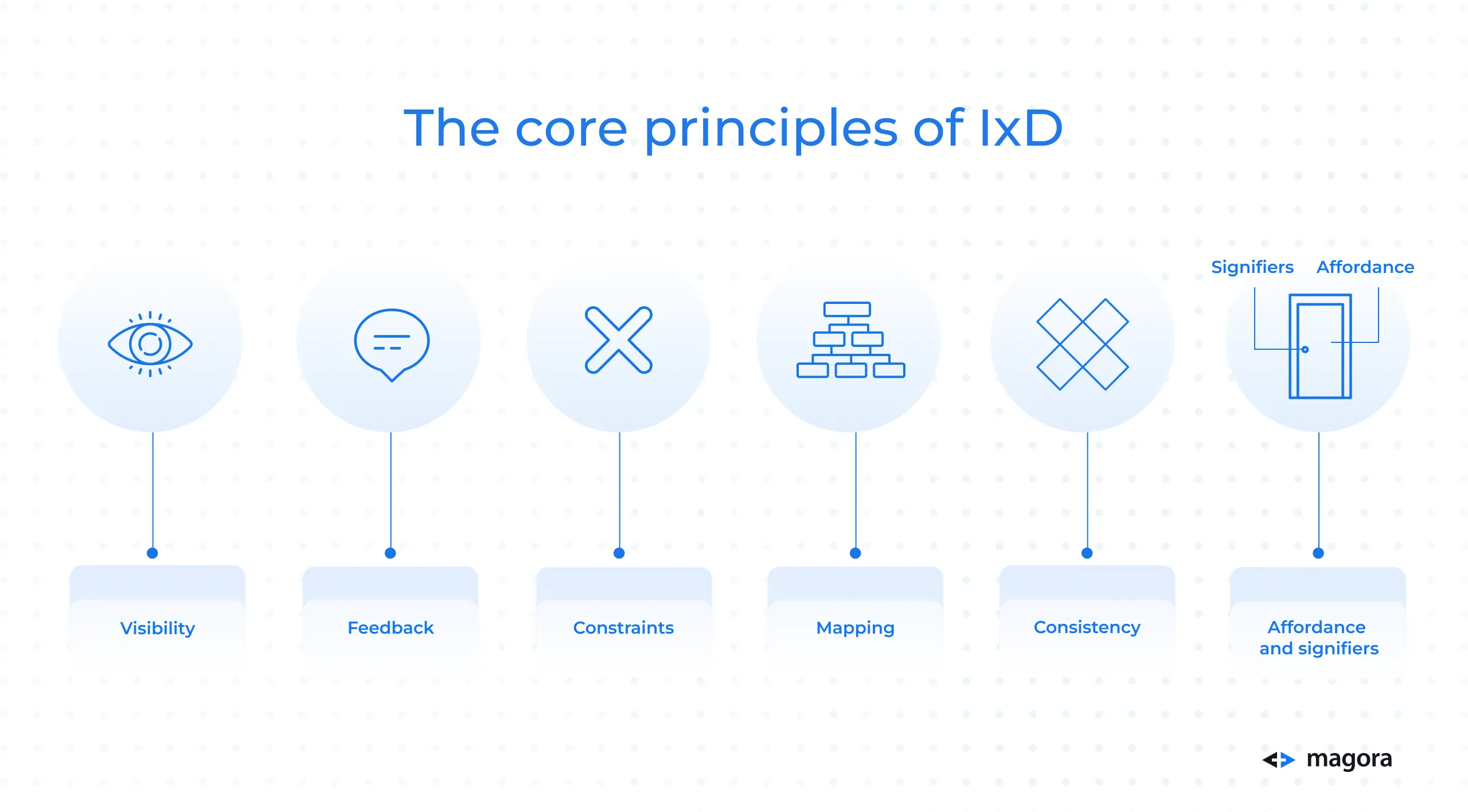
To understand the core principles of IxD, we’ll once again look to Don Norman, a thought leader in the UX space, for guidance.
Visibility
The more noticeable an element is, the more likely ‘users will notice and use it.’
Feedback
The response delivered to a user after they perform an action.
To give some examples, there are several microinteractions – one type of response – that you may have inadvertently encountered, like the Facebook 'like' button which when clicked, changes colour and displays a subtle animation. Similarly, as you hover over a web or mobile app button, a shadow effect may appear, subtly signalling its interactive nature.
Constraints
In the interest of avoiding the wrong action being taken, a system should have behavioural constraints, a button being greyed out to indicate its out-of-action status for example.
Physical constraints are also considered in IxD, a clear example being a mobile phone – ‘there is no way to have [an] interaction outside of it.’
Mapping
The ‘connection between the design and the function linked to it’. Your design should visibly show the link between design and function, as a volume button does when it lights up the bars sequentially as you turn up the sound.
Consistency
Establishing consistent patterns enhances the user’s understanding of your system, simplifying and streamlining navigation. Consistency in this instance is the creation of said patterns.
Affordance and signifiers
The former, affordances, relates to the inherent attributes of an object that enable specific interactions, while the latter, signifiers, are the visual indicators that show the presence of a connection and how something operates.
IxD incorporates user testing and feedback as part of an iterative process to enhance and refine the product. Feedback and responsiveness are integral to creating interfaces that resonate with users on a deeper level, from engagement and clarity to efficiency and ease-of-use. Design adapts to evolving technology with new platforms embraced.
Contextual personalisation
Going beyond standard customisation, contextual personalisation in UX is about refining the user experience by actively responding to individual behaviours and preferences. This involves dynamically adapting content, features, and interactions to meet the user's immediate needs or situation, for example location-based recommendations informed by your mobile phone’s GPS data when you travel to a new country or city.
The objective is to craft a user experience that is not only personalised but also relevant and engaging. These strategies are aimed at empowering users to shape their preferences, presenting dynamically generated content based on real-time data, and employing adaptive interfaces that seamlessly adjust to diverse devices and screen sizes.
Usability matters
Usability, i.e. how easy it is to use, is a key part of your digital product’s overall success. It can give you a competitive edge and mean the difference between the user buying from you or exiting your web or mobile app after 54 seconds (the average time spent on a page) without performing an action.
Aside from the obvious, that an easy user experience swerves frustration and reflects well on your brand – no one likes wasting time navigating a poorly laid out product – it can lead to increased web traffic opportunities thanks to subsequent good reviews, better Google rankings and word of mouth, and wider adoption due to its ease of use.
Understanding the UX
As illustrated above, your approach to UX is no laughing matter.
For your product to top the charts, it must be seamless, meticulously planned, research-backed and grounded in reality – an important part of the process are user flows.
User flows
Depicted in flowcharts or diagrams that map out the user’s software journey, user flows concentrate on the user’s journey from start to finish, noting down their interactions, decision points, and system responses along the way to shape and optimise the UI. Processes are streamlined through meticulous analysis as pain points are identified.
Archetypes
To ground your UX in reality – to really understand what your various personas may want and need – archetypes are crucial.
We touched on persona development earlier and now we’ll look at 10 common user archetypes up close: what they want and why they want it.
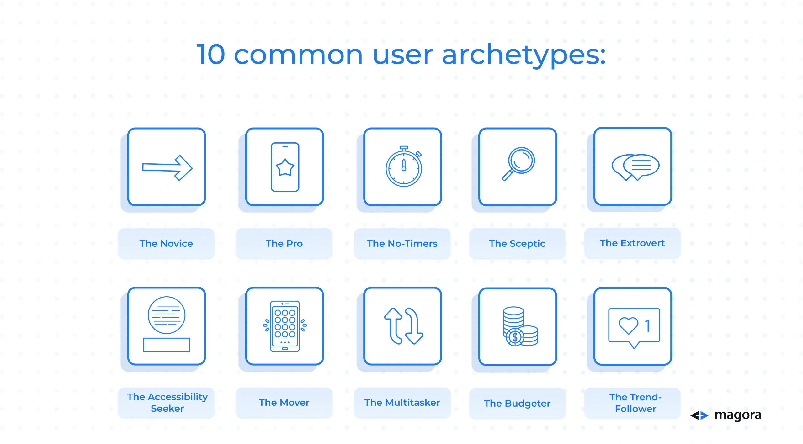
The Novice
Not particularly tech-savvy, they require an easy-to-use interface with simple navigation.
The Pro
They eat, sleep, and breathe tech and seek out shortcuts or efficient access to advanced features.
The No-Timers
With limited time to interact, they like a quick and straightforward journey with minimal steps to achieve their objective.
The Sceptic
They embark on their journey with limited trust, seeking reassurance from transparent and clear information.
The Extrovert
This user loves social interactions and sharing. They are never happier than when they can collaborate and engage with an online community.
The Accessibility Seeker
They can struggle with complex web and mobile app layouts, colour palettes and imagery, requiring a usability-focused, accessible design with attention to detail.
The Mover
Mobile-first, this user wants a responsive UI, interfaces designed for smaller screens, and on-the-go functionality.
The Multitasker
They like to tackle several tasks or challenges at once and need an experience that allows for that. Minimal disruptions and seamless transitions between tasks suit them perfectly.
The Budgeter
Cautious when spending, every purchase is considered, nothing is impulsive. Discounts, offers and clear pricing helps them on their journey.
The Trend-Follower
Loves to jump on the latest trend or innovation on the market. They want the latest tech and features, slick and modern design, with an experience that feels future-led.
Cross-platform UX
Ensuring a cohesive user experience across diverse devices and operating systems, including iOS, Android, Windows, macOS, smartphones, tablets, desktops, and wearables, the goal of cross-platform UX is to provide users with a consistent and familiar experience regardless of the platform or device.
Do your (UX) research!
If you want to perfectly fulfil the needs of your personas, customising to suit their individual requirements – whether they fall into the above categories or have different preferences entirely – you need to do your research.
The four main categories of UX research that must be considered according to Neilson Norman Group are:
Discover
Include user and stakeholder interviews; ‘requirements and constraints gathering’.
Explore
Thorough competitor and task analysis; persona and user story development; journey mapping; prototype feedback and testing; design review; card sorting.
Test
Useability testing and optimisation; benchmark testing; an evaluation of your product’s accessibility.
Listen
Review analytics; survey conducting or assessment; analysis of search-log and FAQs; ‘usability-bug review’.
This holistic UX research approach integrating usability testing and optimisation guarantees a continual refinement of the design in response to user feedback and evolving needs. It operates as a cyclical system, fostering ongoing enhancements to the user experience over the entire product lifecycle.
The Essence of User Stories
Widely used in agile methodologies, user stories are succinct and user-centric narratives that detail specific feature or functionality within the context of a software development project. Widely employed in Agile and Scrum methodologies, they act as a tool for gathering requirements from the end-user’s viewpoint.
These stories can be hugely beneficial for emotionally intelligent design as they delve into motivations and expectations, fostering empathy and understanding by mimicking true-to-life user-centric narratives that breathe energy into a persona.
So, how’s it done?
User stories tend to follow a simple and single template, take Wrike’s for example:
1. Who wants something?
2. What do they want?
3. Why do they want it?
The first question is answered by inserting a persona with true-to-life traits, for example a customer shopping for a bag. The next two questions will be answered in relation to the first, breathing life into your story so the journey becomes clearer.
User stories can be integrated into Agile methodologies for iterative development. Wrike succinctly explains that ‘every user story [involving] a short-form request that is completed in one Agile iteration or sprint, which normally lasts about one or two weeks. Teams measure the complexity of their user stories with story points, helping them to accurately estimate how long a particular request will take.
‘A collection of Agile user stories is referred to as an epic. A product owner will be responsible for managing the epic, but they can be written by any Agile team member.’
User stories play a pivotal role in enabling teams to prioritise and comprehend user requirements, fostering seamless collaboration among developers, designers, and stakeholders. Serving as a user-centric framework for development tasks, these narratives are frequently integrated into a product backlog, thereby guiding the iterative development process.
User-centric architecture
Adaptable architectural patterns play a pivotal role in crafting resilient and flexible systems capable of evolving and scaling to meet dynamic demands, changing technologies, and evolving business requirements.
The selection of a particular pattern hinges on the unique characteristics and objectives of the application under development and can be tailored to embrace user-centric design principles by harmonising the technical architecture with the needs, preferences, and behaviours of the end-users through methodologies like persona and CJM integration, personalisation, and responsive UI.
From microservices – an approach that develops software applications as small, independent services, each running in its own process and communicating through well-defined APIs, breaking down the application into loosely coupled, independently deployable services, each handling a specific business capability – to monoliths – an approach that deploys the entire software as a tightly integrated unit, encompassing the user interface, business logic, and data access layer in a single, cohesive process –architectural patterns offer a flexibility that ensures a seamless user experience.
Wireframes and mockups
Effective wireframes and mockups are indispensable in web and mobile app development for several reasons.
They provide a visual roadmap, aiding in conceptualising the overall design and ensuring a shared understanding among designers, developers, and stakeholders. By allowing designers to concentrate on user experience without visual distractions, wireframes and mockups contribute to a positive user interface. These visual representations serve as a communication tool for early feedback, facilitating iterative improvements before significant resources are invested.
High-quality mockups are instrumental in presenting design concepts to non-technical stakeholders, aligning expectations and streamlining approval processes. Clear visual documentation in well-crafted wireframes and mockups serves as a guide for developers, minimising misunderstandings and contributing to efficient development, while early identification of design issues in the wireframing and mockup stages can lead to cost savings by preventing expensive revisions later in the development process.
They can also be used for marketing and promotional purposes, generating interest and securing early adopters.
UI trends 2024
And now for the fun part.
First, let’s take a look at some of the incredible UI design trends we expect to storm the market next year. Stay ahead of the curve.
Immersive experiences
We can expect an increased focus on AR elements within UI design, providing users with immersive and interactive experiences, while VR elements will likely become more prominent, especially in applications where a fully immersive experience is beneficial, such as gaming and virtual tours.
‘AR could be used to provide users with real-time instructions on how to use a product or service. VR could be used to create virtual showrooms where users can browse and try on products before they buy them.’
Dark mode evolution
Indicators point to the dark mode experience being more customisable, with users having more control over their colour schemes and brightness levels to enhance readability – ‘dark mode is becoming increasingly popular, as it can help to reduce eye strain and improve battery life.’
Minimalistic and sustainable design
With sustainability being a staple of today’s media and social unrest, we can expect to see a continued emphasis on eco-friendly design focused on reducing energy consumption.
Commonplace will be interfaces that contribute to a more sustainable digital environment, including simplified and minimalistic aesthetics: clean, minimalistic designs with an emphasis on essential elements that reduce clutter and enhance user focus.
Adaptive and contextual design
We will see context-aware UI – designs that adapt based on user context, behaviour, and preferences – gain traction, offering personalised and relevant experiences in complement to multi-modal interfaces, interfaces that seamlessly transition between voice, touch, and gesture controls, providing users with a more intuitive and versatile interaction.
UX trends 2024
Now we come to the UX design trends.
Microinteractions and animations
We touched on this earlier in the article, but we can expect to see more of this in future.
Top of the product owner’s wish list is engagement to prevent drop-offs and what better way to encourage the user to stay-on-page than to utilise subtle animations and microinteractions that enhance user engagement and provide feedback for a more dynamic and enjoyable experience.
Expanding on this, emotional design will be a focus next year as designers incorporate animations that evoke emotional responses to foster a deeper connection between users and the digital interface: ‘from joy and excitement to melancholy and suspense, animation techniques are employed to evoke specific feelings in the viewers.’
Biometric integration
In an age when scams and cons are on the rise, software security is a priority for all.
Expect to see more talk around enhanced security through biometrics and the integration of advanced biometric authentication methods, such as facial recognition and fingerprint scanning, for seamless and safe user interactions – ‘it’s clear that biometrics are set to play an increasingly significant role in UX design, opening up new avenues for personalisation, security, and interactivity.’
Data privacy and ethical design
Leading on from the safety of biometrics, designers will be mindful to incorporate user-centric privacy features and strictly adhere to data privacy regulations, prioritising user consent, transparency, and control over personal data.
They should also avoid unethical design practices, instead focusing on creating interfaces that promote positive user behaviour and mental well-being (dark patterns and manipulative design are a no-go).
And finally…
AI-integrated design
You may have already noticed the ever-increasingly chatter around generative AI and AI-integrated design.
From advanced chat bots and code-writing to image generation, AI is already shaping the digital products you use and will shape more in future: ‘AI-powered tools can be used to improve overall efficiency when it comes to the user experience [while] AI content can also help streamline research processes for UX designers by automating tasks such as content curation and recommendations.’
Voice User Interface (VUI) advancements will take centre stage. From conversational interfaces that improve natural language processing to conversational UIs for a more seamless interaction through voice commands. Likewise, we can expect to see a surge in voice-activated navigation through the integration of systems that improve accessibility and hands-free usability.
By staying attuned to and engaging with these anticipated UI/UX trends and technologies, designers and developers can stay ahead of the curve and create digital experiences that not only meet user expectations but also set new standards for innovation and usability in 2024.
Looking ahead: conclusion
In the dynamic landscape of UI/UX design, understanding the principles, methodologies, and emerging trends is paramount.
By embracing a user-centric approach, integrating innovative technologies, and staying ahead of evolving preferences, designers and developers can shape digital experiences that exceed user expectations in 2024 and beyond.


