Web Design Trends in 2024

Table of contents
- Design of your business
- AI-Generated Imagery
- Typographic Hero Images
- Bento Box Design
- Microinteractions in Web Design
- Microanimations in Web Design
- Hover Animations
- Parallax Scrolling
- 3D Web Experiences
- Dark Mode Toggle
- Magora's Approach
- Conclusions
Crafting a captivating online presence is more than a trend—it's a key to success. Your website or web app design is the frontline of your digital identity. Recognizing the power of web design is unlocking a pathway to effective online engagement for your business. It's not just about looks; it's about creating an immersive experience that resonates with your audience, fosters exploration, and drives conversion. In a world where first impressions matter, investing in web design is not just wise—it's essential.
Design of your business
You may be wondering why web design matters and how to create an effective layout when you're developing a web app. How can you make sure you've covered every important aspect of website design?
The point is, there's more to developing and designing websites than meets the eye. It significantly affects how the customer perceives your brand in general and is no less than a key factor determining whether they have a positive or negative impression when exploring your web app.
Future trends promise to be exciting, ranging from simple, minimalist designs to animated elements that captivate and excite your web app’s users. Examining current developments and their potential benefits is a fine way to create the most effective design for your company’s web solution.
AI-Generated Imagery
Skilled artificial neural networks are used by AI picture producers to generate original pictures. Such generators are capable of producing unique, lifelike images from information given in natural language. Being able to combine styles, themes, and features to create visually striking and contextually appropriate work is what sets them apart from the others. Generative artificial intelligence, a branch of artificial intelligence that specializes in content production, makes this feasible. For example, DALL-E 3 is the latest version of OpenAI's advanced AI system that generates highly detailed and accurate images from text descriptions.
Meta recently released a new AI image generator - Emu - which was trained on 1.1 billion Instagram and Facebook photos.
Using tools like these, businesses can benefit and make content creation, prototyping and design, personalization, creative campaigns, data augmentation and many more much easier and faster.
.webp)
Typographic Hero Images
Adding some personality to your company's identity through a hero image, which is typically a professional photograph or video content, may help establish reliability and confidence right away. Placing beautiful, large picture at the most prominent spot of your website is able to make an excellent first impact as humans are extremely visual creatures. Safari Riot, an LA artist development firm, boasts a sleek, modern website with a monochromatic design. The standout hero section, highlighted by large typography, adds a bold touch to the overall aesthetic.
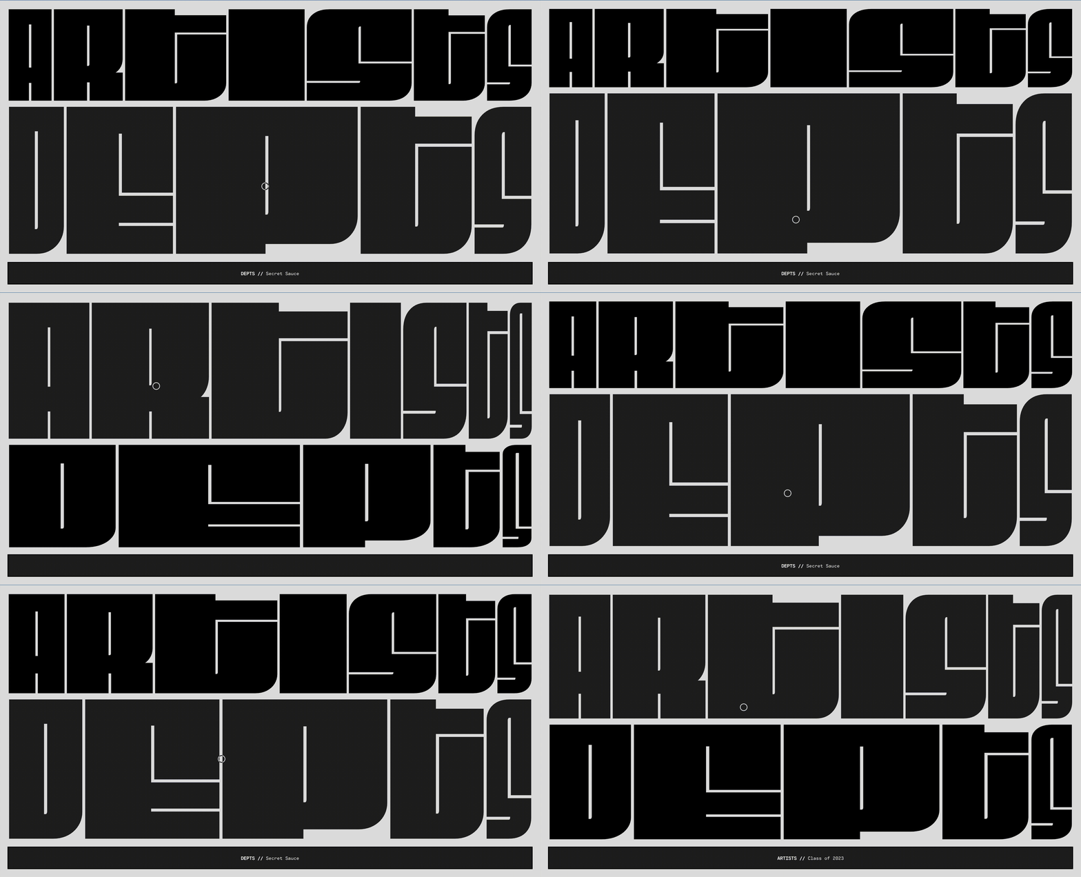
In addition to serving as an invitation for action or destination, an inspiring picture can also showcase your company's value message at the beginning of the homepage - just like Spotify does. Spotify's website often uses bold typographic hero images to convey the mood and style of different music genres. The use of large, impactful typography creates a visually engaging experience. Hero photos are another useful tool for grabbing readers' focus and encouraging them to dive into the content of the website.
Bento Box Design
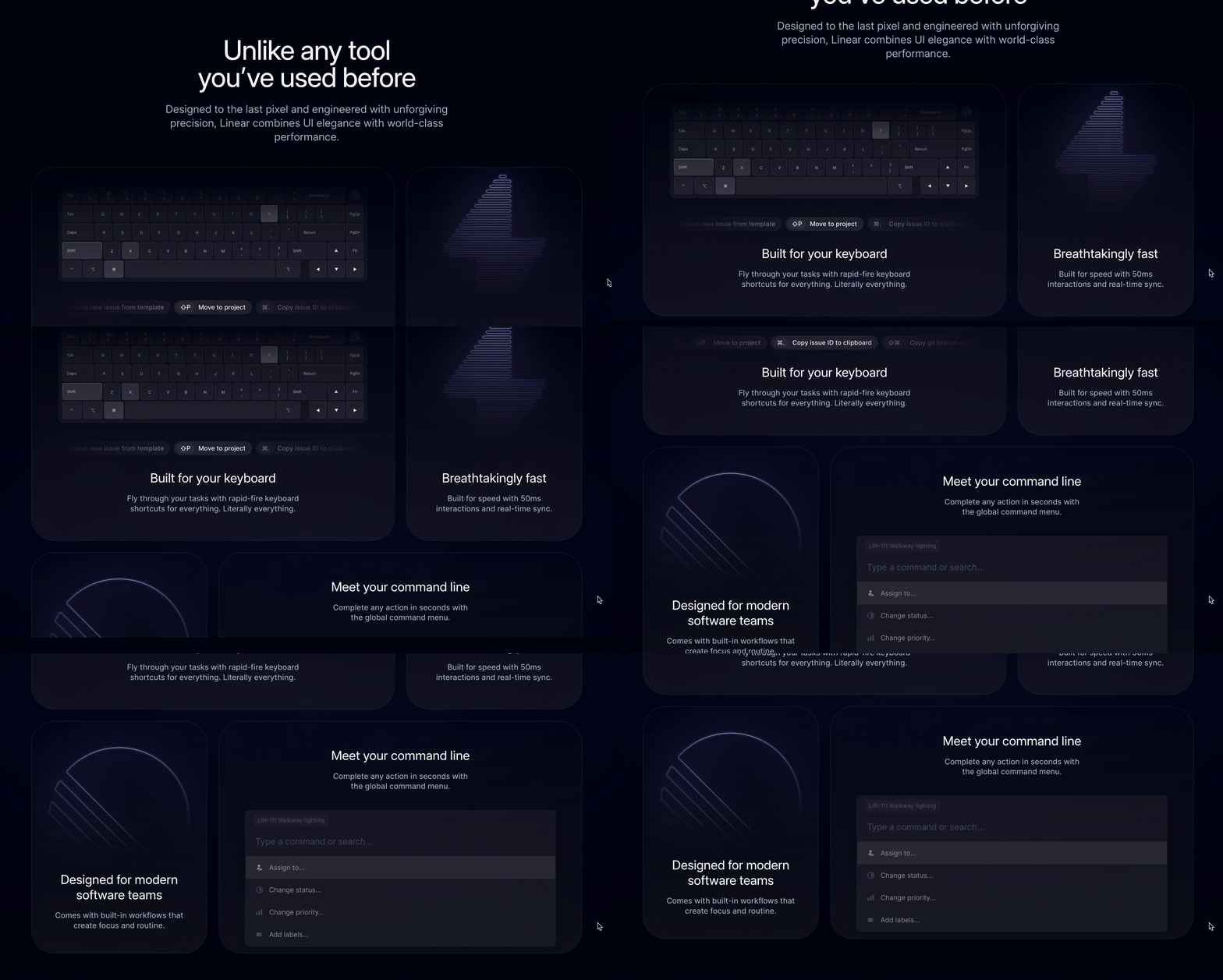
Taking inspiration from the concept of bento boxes, web designers in 2024 may embrace a modular and organized approach to layout and content presentation. Like the carefully arranged compartments of a bento box, websites could feature well-defined sections, each serving a specific purpose or content category. This modular design not only enhances visual appeal but also contributes to a more user-friendly experience, allowing visitors to navigate seamlessly through different elements of the site.
Similar to the variety in a bento box, websites might incorporate diverse content types within their modular structure—ranging from text and images to videos and interactive elements. This modular design philosophy not only aids in maintaining a clean and structured layout but also facilitates easier updates and modifications, ensuring adaptability to changing content needs.
A stellar example of Bento Box design is showcased on the Linear App website, where the meticulous arrangement of compartments seamlessly blends form and functionality. This design not only prioritizes visual harmony but also ensures optimal organization and accessibility.
Microinteractions in Web Design
Microinteractions are the tiny, interactive details in web design that respond to user actions, enhancing the overall user experience. From button animations and form validations to loading spinners and notification alerts, these subtle elements provide instant feedback, guide users through tasks, and make the digital interaction more engaging and intuitive. Well-designed microinteractions contribute to enhanced usability, quick feedback, increased engagement, and the infusion of brand personality into the user interface. They are the small yet impactful details that elevate a website's overall design and user satisfaction.
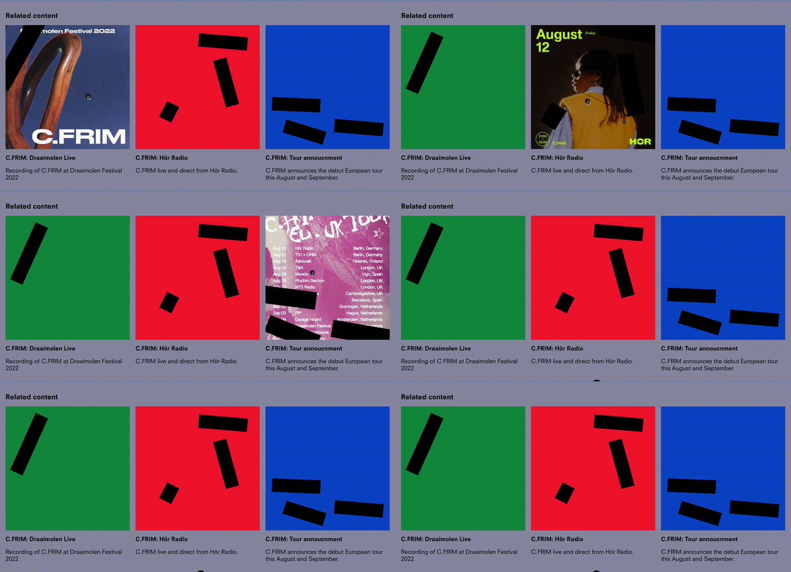
Ekipa Agency, based in Berlin, specializes in booking electronic music artists with a small roster of international talents. The meticulously designed website features a playful interface, including scattered links in Neuzeit typeface that darken on hover, a cursor as a black dot, and a changing background color upon page reload. The result is a masterfully crafted, fun, informative, and brand-aligned webpage.
Despite being frequently disregarded, they are essential for assisting you in navigating an item and enhancing customer satisfaction. On LinkedIn, for example, microinteractions are present in features like the 'Like' button. When you click the 'Like' button, a brief animation occurs, providing feedback to the user. These small, subtle animations enhance user experience.
The fact that microinteractions have a significant impact on the customer's impression makes them quite valuable. By informing consumers about what's going on, they enhance the product's usefulness, increase customer engagement, and offer consumers more authority.
Therefore, it is important to include microinteractions on your website or in a web app, but also to make sure they are of high quality and can make your consumers happy.
Microanimations in Web Design
Micro-animations can be described as little movements that connect different parts of a screen or a layout. In other words, they are visual signals based on the customer feedback, improving the accuracy of the user experience approach and ensuring that the user interface accurately depicts your activities.
Micro-animations are not quite the same as micro-interactions. Animations result from micro-interactions, and micro-interactions are activated by an impulse and are developed into a series of visualized commands.
Micro-animations in web design include toggle switches, entrance/exit animations, progress bars, hover effects on buttons, and fade in/out effects. These subtle touches enhance user engagement and provide visual cues, making the interface more dynamic and user-friendly.
Payment infrastructure service Stripe has a perfect example of this trend on their website and inside their solutions. Stripe incorporates microanimations in its user interface, such as subtle transitions between different sections and interactive elements. These animations contribute to a smooth and delightful user experience.
Hover Animations
The alterations that take place on a website when you move your mouse over an element are known as hover effects. It could be as simple as a size or color adjustment, or it could be a more intricate animation or transition. Regardless of the outcome, it gives your website or user interface an additional degree of engagement that can improve the user experience.
The Hover Animation function may draw attention to important content on your website, improve user interaction, draw visitors in, and motivate them to take action. Depending on your goals and the layout of your website, you have the opportunity to select the most suitable ones from a wide variety of hover animations.
Hover animations, for example, can encourage readers to fill out a form in order to enhance sales. Moreover, you may apply Hovers to motivate visitors to place an order, press on social media symbols, and fulfil any "call to action" that appears on a button.

Parallax Scrolling
A website's background appears to remain motionless as the foreground moves either vertically or horizontally. Such visual effect is known as parallax scrolling. A website can captivate users and add visual interest while they navigate across pages by using parallax scrolling.
The backdrop and foreground of a parallax scrolling effect are both moving, but the background usually flows considerably more slowly, creating a sense of space. When parallax scrolling is done right, it creates an engaging and smooth virtual environment.One of the most inspiring example full of brilliant graphics and inventive parallax effects is Webflow web design & art history microsite.
.gif)
3D Web Experiences
In the realm of web design, the integration of three-dimensional elements has become a pivotal aspect of creating visually engaging and dynamic online experiences. By introducing shades and textures to features like dynamic text, interactive scrolling, and images, designers add depth and realism, transcending the traditional two-dimensional confines.
One popular application of 3D design on websites is its utilization to draw attention to specific elements such as words, images, or key features. This technique serves as a strategic means to highlight calls to action, spotlight important details, and enhance overall user engagement. The dynamic nature of 3D design brings a sense of vitality and interactivity, contributing to a more immersive digital environment.
A compelling example showcasing the power of 3D web design is evident in the innovative approach adopted by Dala Website, a groundbreaking AI search tool. The entire website serves as a captivating three-dimensional space, inviting users to explore various sections in a manner that transcends traditional navigation. This unique and immersive design not only captures attention but also provides an enriching and interactive experience for visitors.
.gif)
Dark Mode Toggle
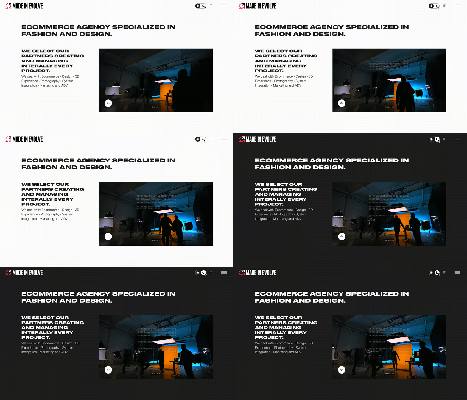
Thanks to the Dark Mode Toggle, using just one mouse click, visitors of the website can effortlessly transition from light mode to the dark one. The purpose of this addition is to improve browsing, particularly at night or in dimly lit areas, by offering a more pleasant and visually appealing light and colors of the screen.
Usually, the case is that you want to create a darker theme because you currently have a light one. Or perhaps you are about to create a website for your company, so you need to consider including both themes from the start. One theme needs to be specified as the standard one, which visitors see when they first come to the website, which is typically the light theme. A button for switching the themes should be easy to detect and click. Made in Evolve Website offers a dark mode toggle, allowing users to switch between light and dark themes. This feature is not only aesthetically pleasing but also reduces eye strain, especially in low-light environments.
The criteria of your project will determine the "correct" approach. For instance, you might use CSS attributes if you are working on a big endeavor. However, if your project must support older browser versions, a different strategy will have to be used.
Overall, it all depends on your audience and the peculiarities of your product. There are situations when using a mix of techniques will provide the best results.
Magora's Approach to Crafting Exceptional Web Designs
At Magora, crafting exceptional web design is a meticulous process that revolves around user-centric principles and agile methodologies. Our journey begins with in-depth user interviews, where we gain valuable insights into their needs and preferences. This user-centric approach is fundamental to creating a design that resonates with the target audience.
Following this, we employ the Conceptualization, Justification, Mock-up, Specification (CJMS) framework, a structured methodology that guides our design decisions. Wireframing comes next, providing a skeletal representation of the website's structure and functionality.
Design prototyping adds life to these structures, allowing stakeholders to visualize the final product. Before finalizing the design, we rigorously validate it with users, ensuring it aligns seamlessly with their expectations.
Operating within an agile framework, Magora's design process is iterative and flexible, allowing for quick adjustments based on continuous feedback. This dynamic approach ensures that our web designs not only meet but exceed user expectations, resulting in visually stunning and highly functional digital experiences.
Conclusions
Web designs are constantly changing, the same as any other digital invention. The desires and tastes of the audience, along with aspects of society and modern technology, all have an impact on them.
The entire process of creating a professionally designed website involves several steps, and the above-mentioned ones are only a few of the current innovations. As a result, the website design agency you choose to deal with needs to be entirely acquainted with the nuances of both online design and marketing as well as website development.


